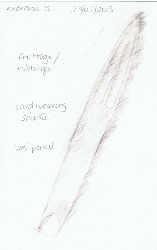
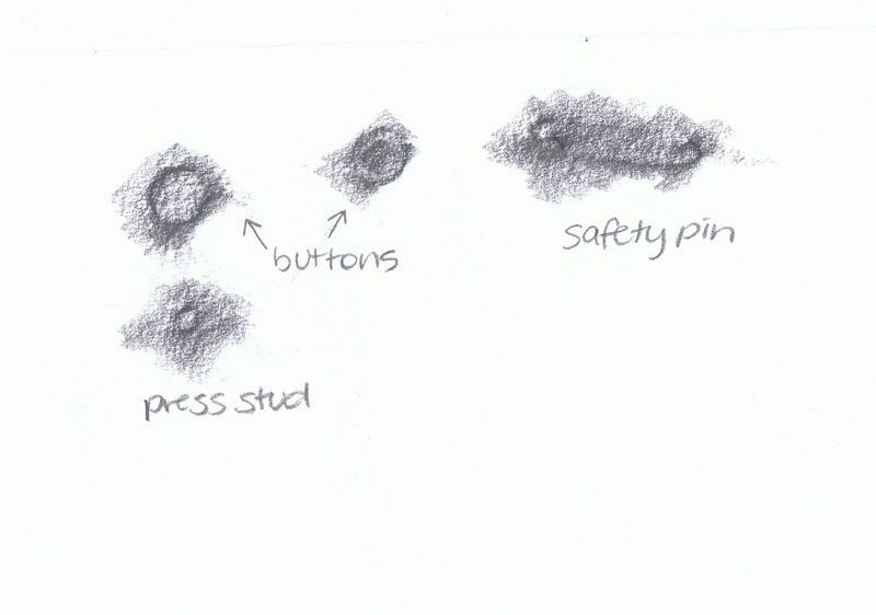
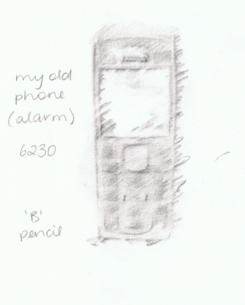
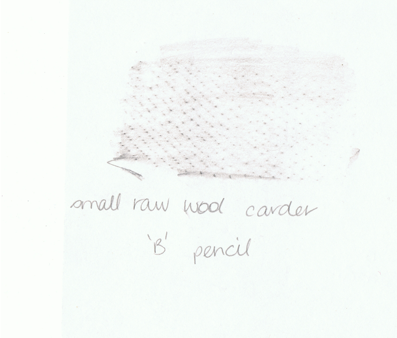
A Creative Approach — Project 2 Developing your marks — Stage 1 — Preparation
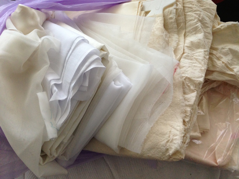
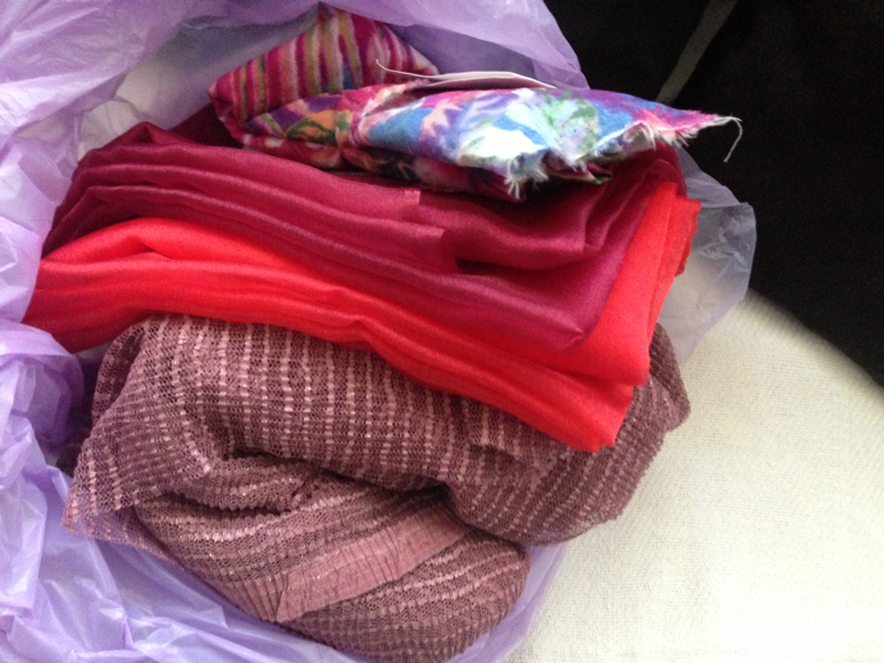
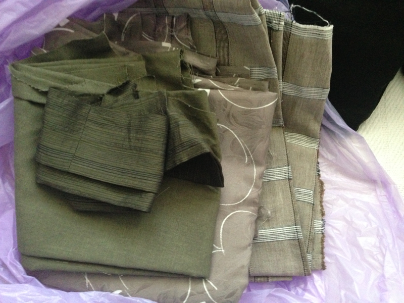
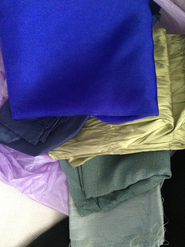
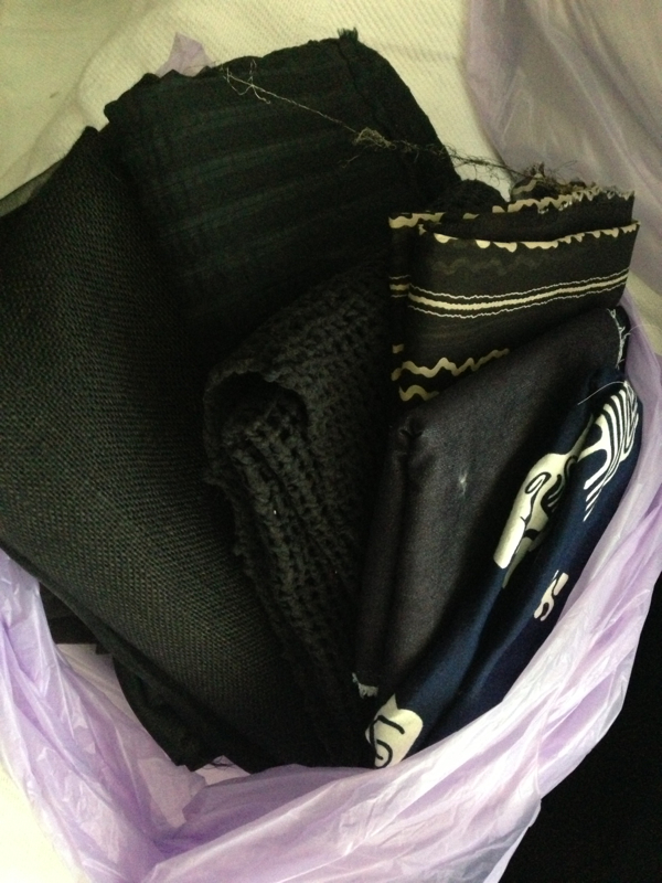
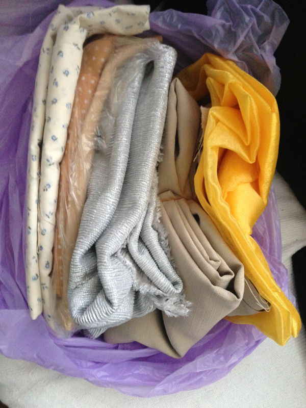
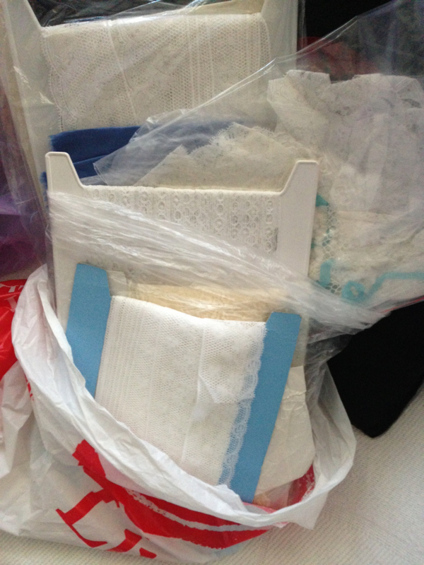
The first stage of this exercise was to sort my fabric stash into bags. I chose to separate them by colour. There are a couple of crossovers with the greens/browns.
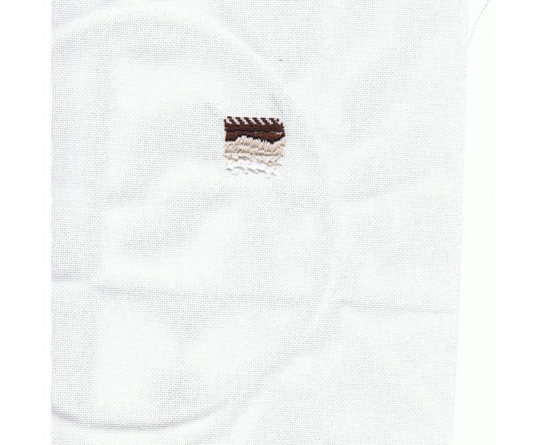
Machine embroidery
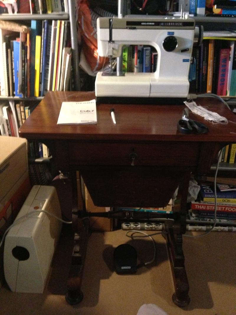
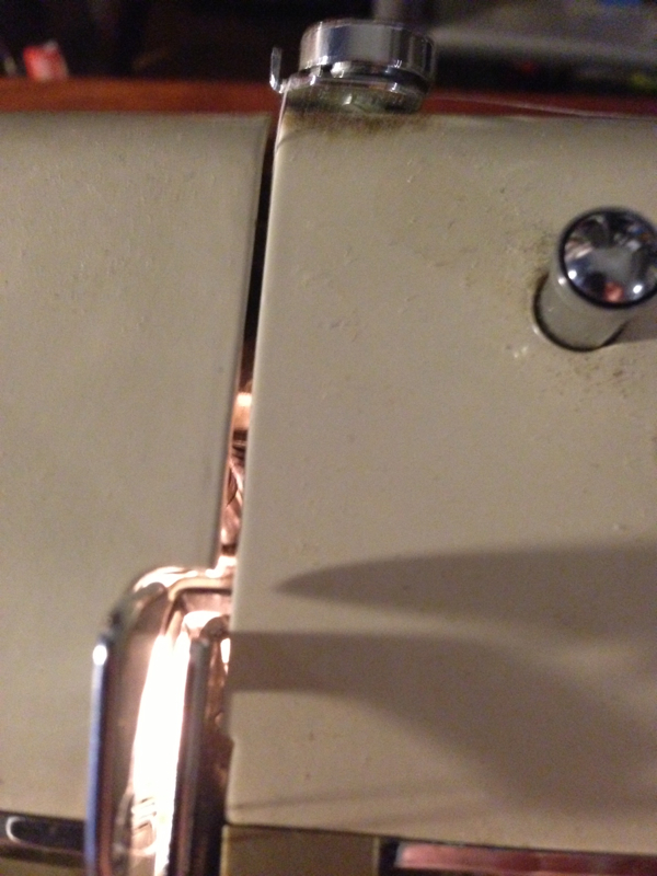
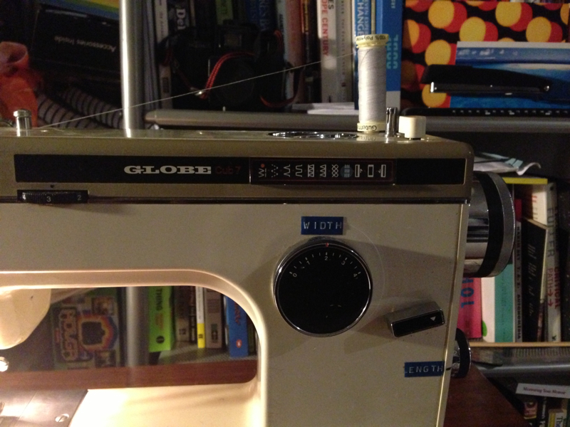
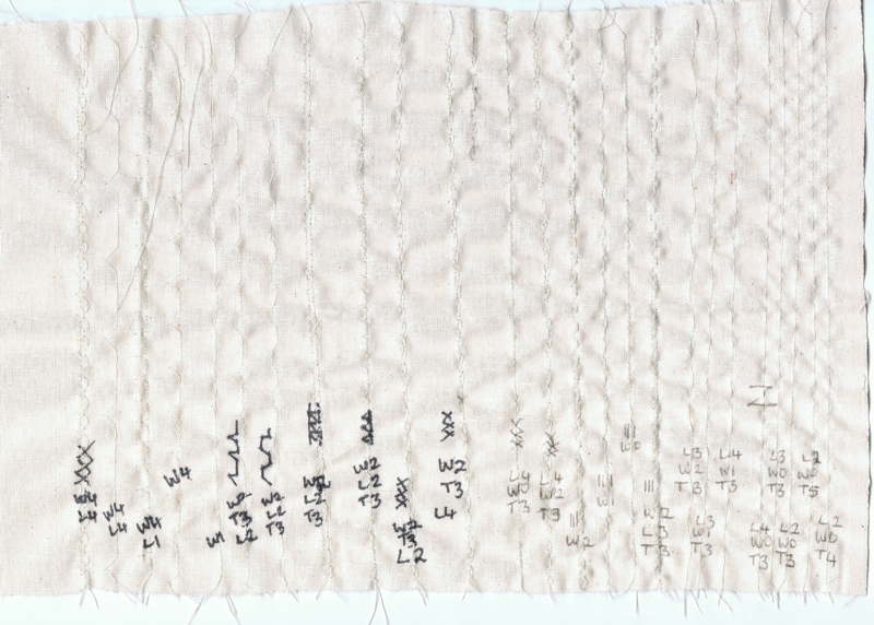
I’m using my boyfriend’s mother’s sewing machine — a Globe Cub 7. So to start with I had to read the manual, learn how to thread it, load the bobbin and position it correctly. I did have a little Singer sewing machine years ago but I had given it to a friend who was using it more than me. So it had been many years since I had last used a sewing machine.
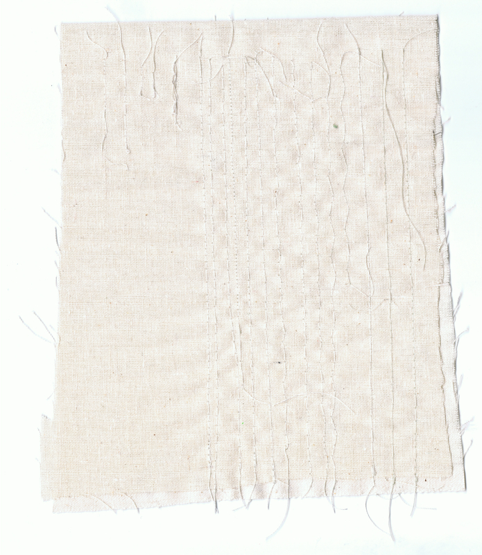
I tried some practice stitches on a piece of folded calico. I wrote the tension, width, height settings on each stitch row. I worked the calico from right to left. Sometimes the machine thread broke, especially when I tried the synthetic thread. When I switched to cotton thread it was better.
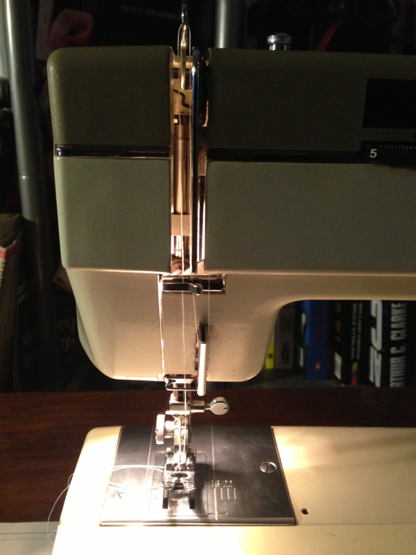
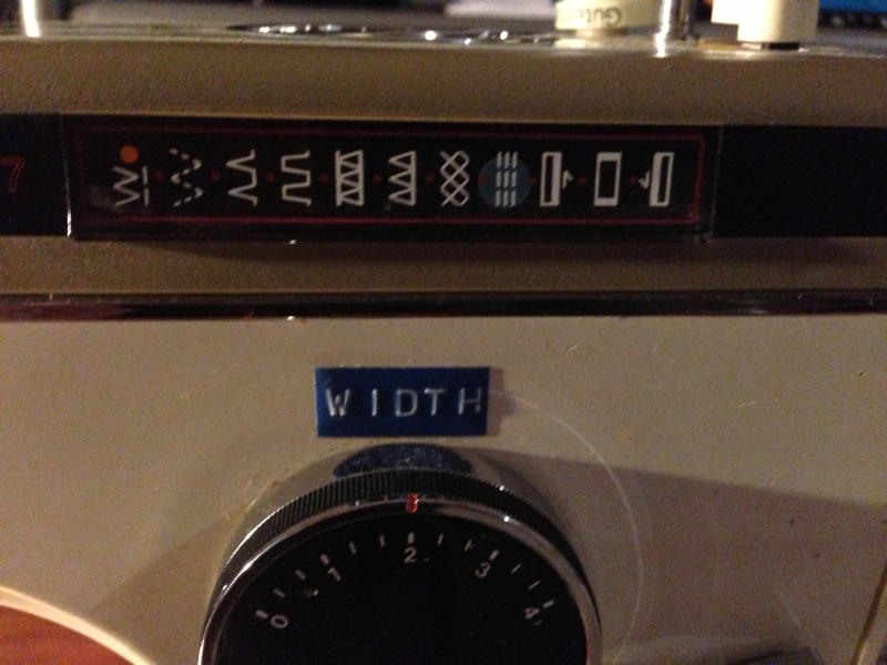
The Globe seems to have a built in glitch — I noticed that the machine seems to skip some stitches, especially when length < 4. when doing straight stitching it irregularly misses a stitch so the stitch lengths are varied. I tried different settings to see if it was the tension & it improved a bit but still has this. Purists would call this a fault, but I love it — it means there’s always a surprise! I think this is perfect for fibre/textiles art. For sewing dresses it might cause a few issues, but I don’t do that often & prefer the textiles art anyway. It’s a bit like those old synths with quirks that make it sound special. It has a character of its own. Lovely!
08/09 Update: I’ve since had the sewing machine serviced as my sister had told me the missed stitches were due to a timing issue with the machine. Now it stitches correctly. Whilst I miss the glitches sometimes, it is nice to have a machine that stitches properly again.
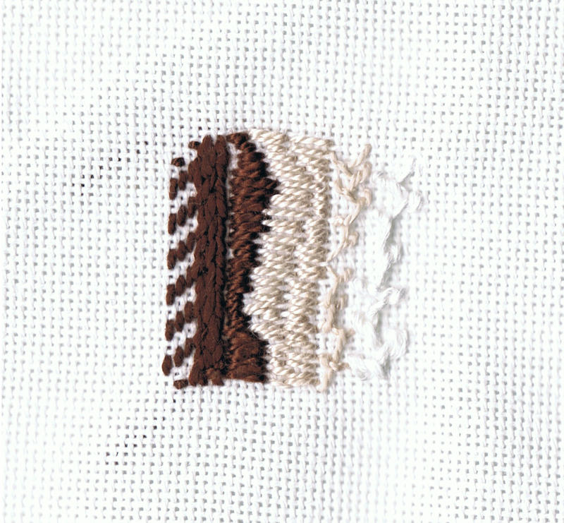
Front side:

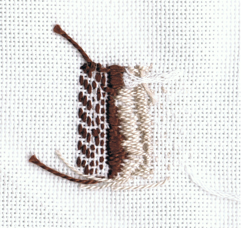
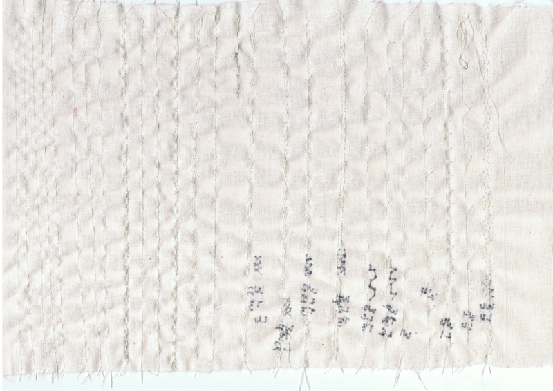
Rear side of fabric:
Front side:
Rear side of fabric:
08/09/2013 — I retried some of this exercise after the sewing machine service and had better results. Even the machine embroidery worked now!
(stage5-03-rear.jpg)
(stage5-03-rear-zoom.jpg)
(stage5-03.jpg)
(stage5-03-zoom.jpg)
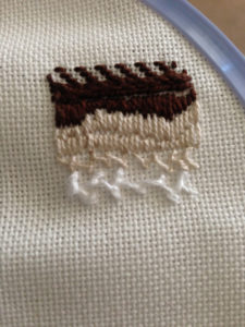
Hand embroidery
I also tried some hand embroidery on linen, but I am much slower at this! so didn’t get too many stitches done. The stitches I tried were:
- running stitch — 2 rows, offset from each other;
- stem stitch — 3 rows close together;
- satin stitch — a couple of varying width sections;
- half Cretan stitch — I hadn’t tried this stitch before so it didn’t quite work out. I’ll need to practice it more. The light was fading as I was doing it also so it was hard to see.

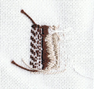
Close up – front side:

close up – rear side – actually I like the different size stitches of the stem stitches on the underside (wrong side of the fabric), so I’ll try some others like this with different length running stitch on the front side of the fabric:
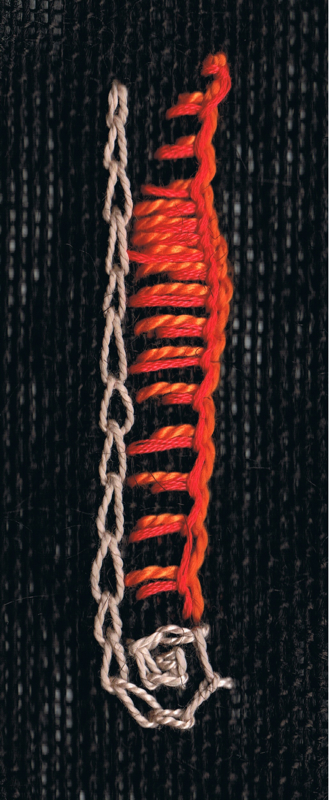
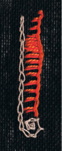
Chain stitch is new to me, so I tried it first. Initially I did a straight line, but then I added a curve/circle at the end of the line. This was using DMC #5, Perle colourway 842. I’ve used blanket stitch in grass woven baskets, but I didn’t know how to start it on fabric, so I watched the video tutorial. I did a couple of rows of blanket (button hole) stitch — the first was using DMC #3 Perle colourway 740. The second row was using DMC #25, colourway 608 — a thinner, darker shade of orange. Both of these stitches were done on black hessian using a hoop. I made different length stitches and different widths, and placed the two orange colours adjacent to each other. I think this creates a nice texture for the blanket stitch sample. The orange doesn’t go that well next to the cream coloured chain stitch, but I think both look good against the black hessian if you look at them separately.
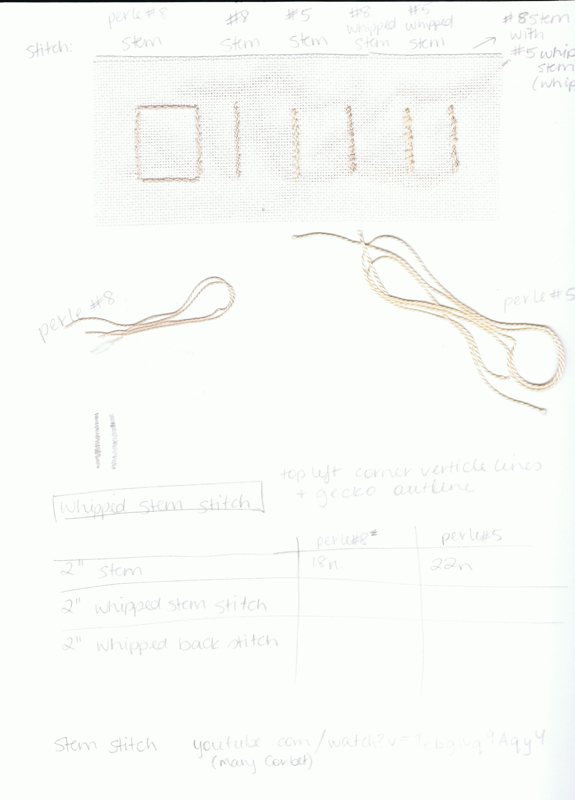
When I practiced whipped stem stitch, I made some notes, samples and added thread cuttings to my journal