A Creative Approach — Project 2 Developing your marks — Stage 2 — Exploring marks and lines through stitch techniques
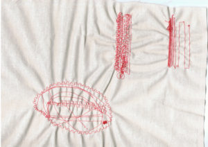
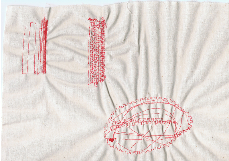
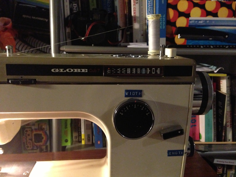
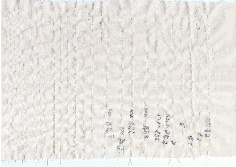
For this exercise, I started with machine embroidery. I dropped the feed dogs and put the fabric into the hoop, but I had to remove the footer each time I had to start sewing. The first stitch I tried, the machine just sewed on the same spot — almost like satin stitch. I found it really hard to move the fabric around. So I ended up taking the fabric out of the embroidery hoop, lifting the feed dogs again and sewing normally. This time I used red thread so it’s easier to see the stitches (the first exercise was off-white on cream calico so is harder to see the stitches clearly). I didn’t have any other machine threads of different weight to try the hand wound bobbin.
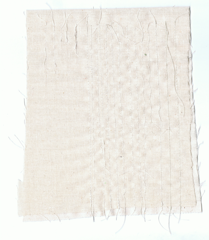
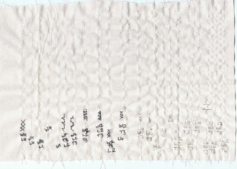
I made some parallel lines, moving closer together until they made a solid area (albeit small solid area!)
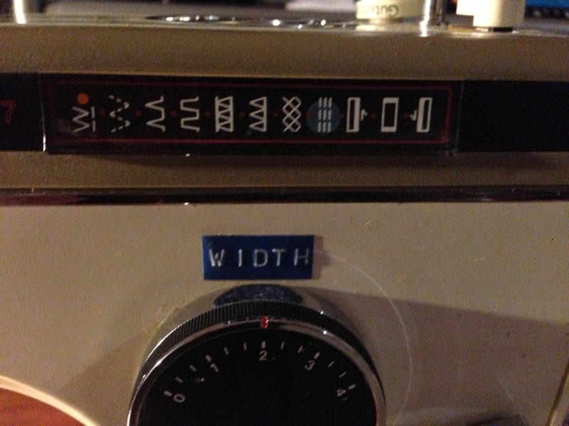
and I tried some circles, though they’re a bit wonky. I also tried some “squaretooth” stitches as I liked the shape of these. I must have a tension issue as there’s a bit of puckering of the fabric where the stitches have pulled the fabric around the stitches. I did try different stitch lengths. When I did the test swatches I found that tension=3 was the best setting, so I kept this the same for all the stitchings
Front side of the fabric:

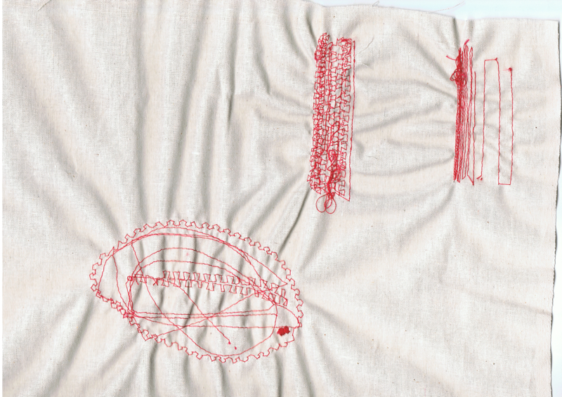
Underside of the fabric:
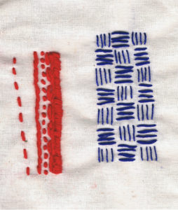
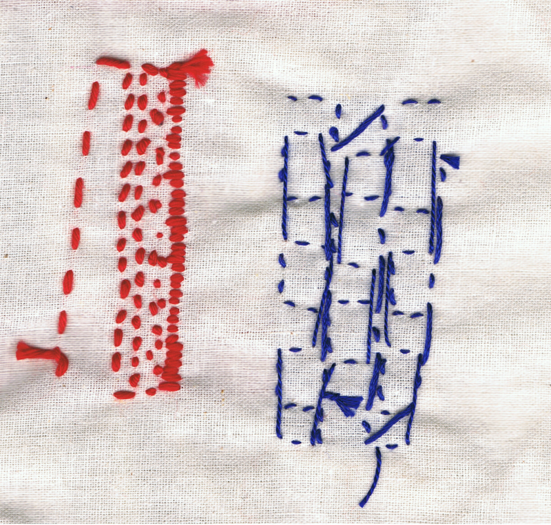
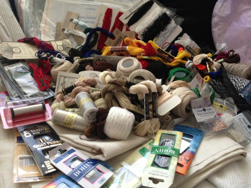
Next I tried some hand embroidery using different weight and colour threads.
The sample on the left (red thread) is a mix of running stitch – using different stitch lengths, stem stitch, back stitch and a short satin stitch.
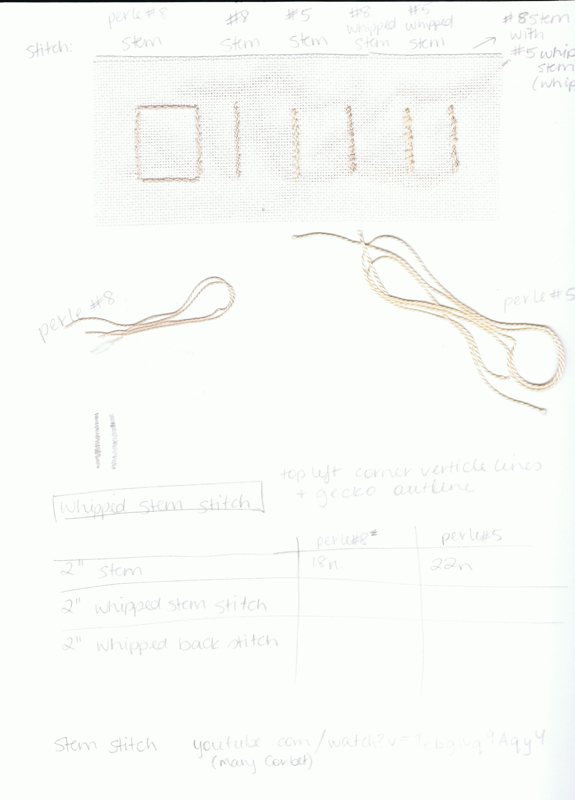
The sample on the right (blue thread) is a pattern of horizontal and vertical running stitches, using similar colour range and slightly different thread weight. Horizontal threads are made with “mouliner special” DMC 25, colour way 796. The vertical threads are slightly thinner, DMC #8, colour way 820.
Front view:
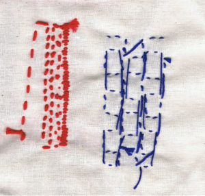
Rear view:
Once again, I like the underside of the fabric, especially when viewed from a distance.
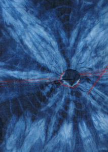
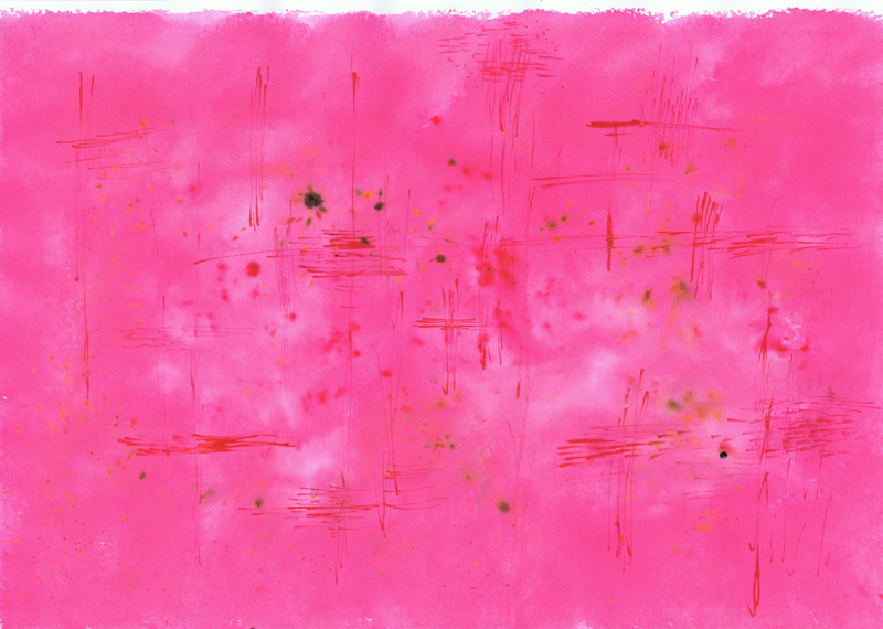
For the next sample, I used a piece of cotton I’d dyed at a Shibori workshop a few weeks ago. To make this piece, I’d put a coin in the centre of the fabric, then wrapped it in string. you can see the fine, lighter coloured string markings on the fabric. I sewed some straight lines, squaretooth lines and zigzag lines in red cotton. I also tried circular lines around the centre where the coin imprint is, and some diagonal lines too. The centre of the fabric puckered a bit, so it’s raised compared to the surrounding fabric. When I scanned it, it squashed down and covered some of the stitches
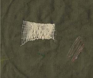
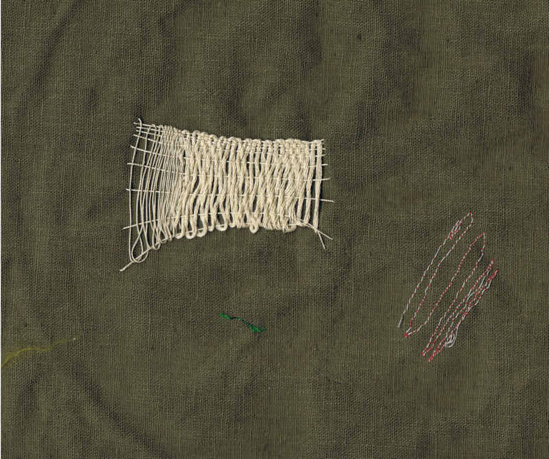
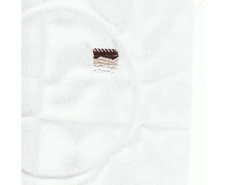
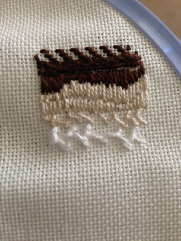
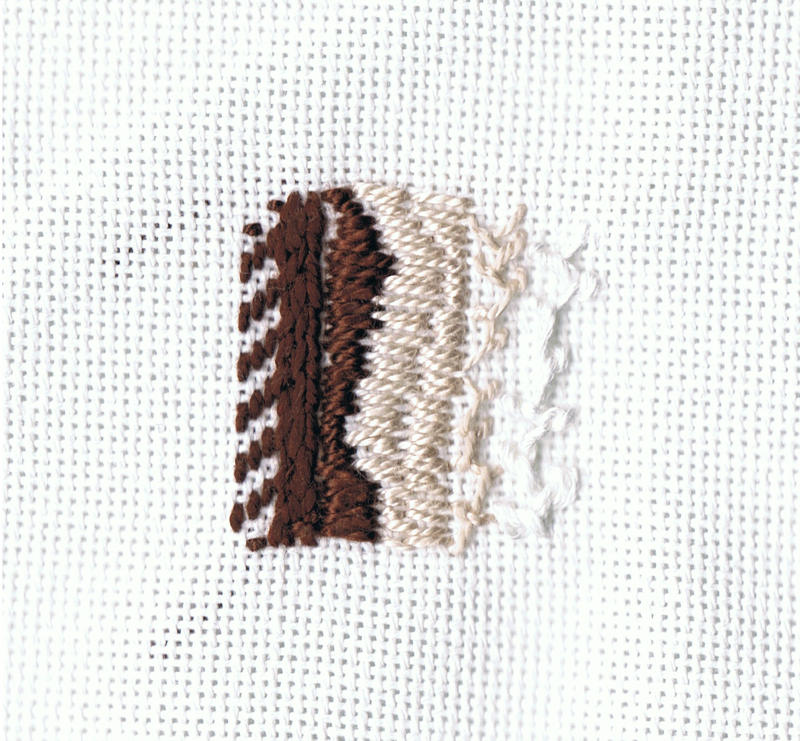
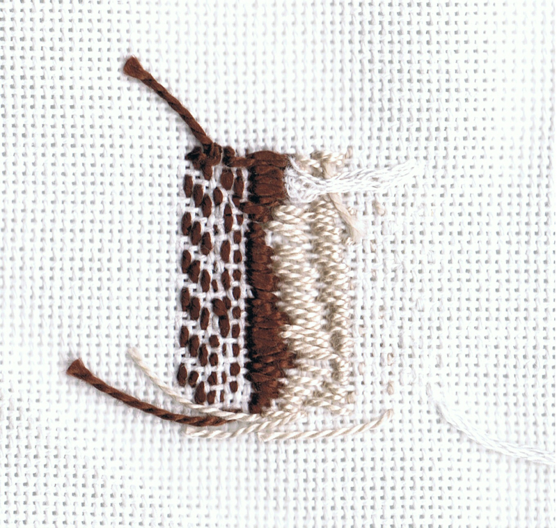
11/08: Today I tried some darning stitch (Sue Stone calls it needle weaving) — though I changed the width of the stitches so the first are further apart than the latter stitches. I also changed thread — from a thin cotton to a thicker embroidery thread. It was like weaving with the needle & thread. I think it could have been a bit neater, and now that I see it with varied stitches, I prefer the more uniform, loose weaving that Sue Stone does to my experiment. I will try another later to more closely match how she does hers.


