Using marks to create surface textures – exercise 2

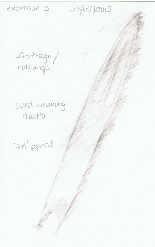
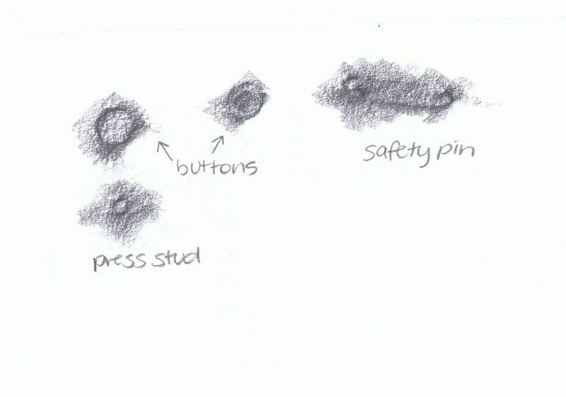
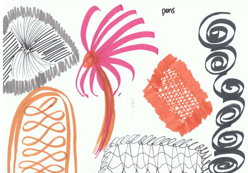
A Creative Approach — Project 1 Marking marks — Stage 3 — Exercise 2 — Using marks to create surface textures

This exercise involved recreating the textured surfaces of objects.

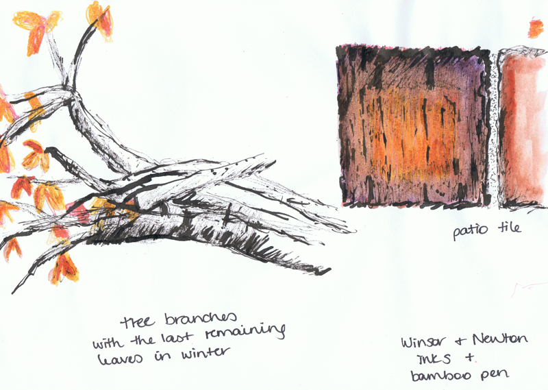
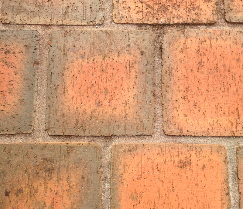
This first page has a drawing trying to replicate the texture of patio tiles, and another showing the branches and remaining leaves of a tree that had lost its leaves during winter — as viewed from the patio whilst looking across the garden. I painted the watercolour wash over the ink drawing in the evening, and thought I was using a brownish grey colour but when I checked in the light of day the next day, I’d actually used a purple colour. Oops. So the colours are not 100% accurate but hopefully the feel of the texture shows through:
project1-stage3-ex2-01

project1-stage3-ex2-04

project1-stage3-ex2-05

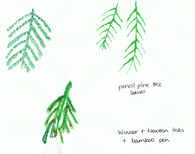
The second group of drawings are of the leaves on a pencil pine. At first I thought the segments of the leaves were like little nodules, so I drew the first one (top right) with drops of ink, but when I looked closer I noticed that there were small crosses along the leaves segmenting the sections. I thought this would suit cross-stitch, so tried to draw it in inks and then paint over the top. the problem I found is I couldn’t mix the correct lighter shade of green to draw the crosses. On the weekend I only had my inks and bamboo pens as I was away for the weekend. When I came home I painted the crosses on, though my technique isn’t that good — and probably the paintbrush I used wasn’t fine enough, so the crosses are a bit rough:
project1-stage3-ex2-02

project1-stage3-ex2-06

project1-stage3-ex2-06b

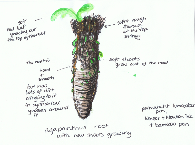
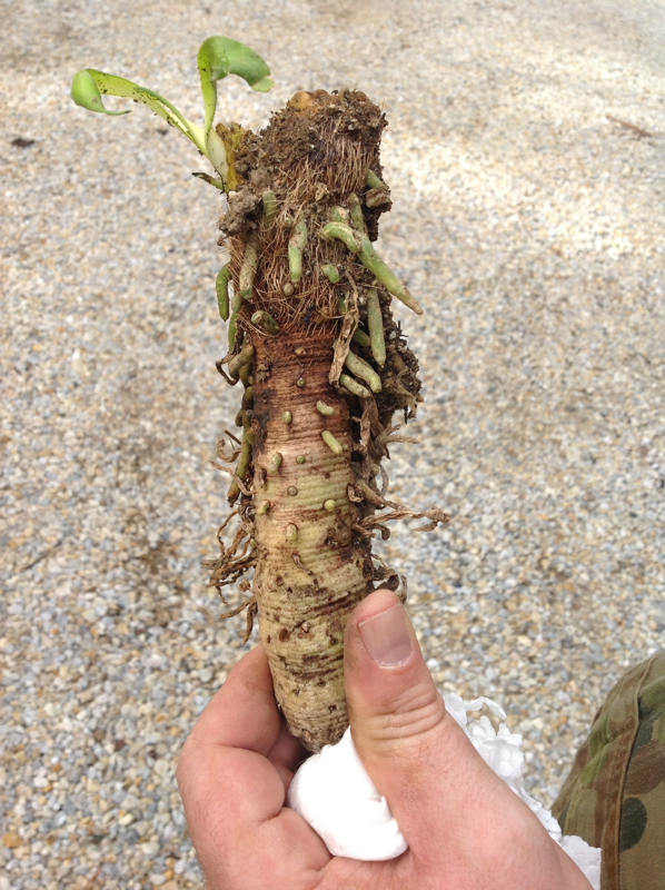
The last one is trying to replicate the textures on a root of an Agapanthus plant. These plants are a pest in the native garden so J pulls them out whenever possible. He was showing me the shoots coming out of the root. I thought it had a nice mixture of textures — smooth surfaces, hard and soft parts, fibrous, stringy parts and soft leaves. Also I liked the concentric ridges around the root — it reminded me of how I actually draw a cylindrical surface on paper.

Even though the Agapanthus root is quite ugly, I quite like how this textural drawing turned out.

project1-stage3-ex2-03

project1-stage3-ex2-07

Using marks to create surface textures – exercise 1

A Creative Approach — Project 1 Marking marks — Stage 3 — Exercise 1 — Using marks to create surface textures

This exercise involved using marks to create surface textures — working from visual sources.

For these exercises I used pages from a magazine – “belle” magazine, june/july 2013

This first one is trying to replicate the textured rug, using graphite and charcoal pencils:
project1-stage3-ex1-01

project1-stage3-ex1-02

For the second drawing I was trying to replicate the soft, blurred, smudged look of the glass. The blue definitely worked better than the yellow glass. The yellow paint was too wet and just came out as flat colour.
project1-stage3-ex1-03

project1-stage3-ex1-04

In the third one, I tried to replicate the curves. I didn’t have silver pens or paints so I used blue Copic pens for this attempt:
project1-stage3-ex1-05

project1-stage3-ex1-06

AR quilt

tonight I was reading through class notes again and just realised I have more to do for assignment one than I thought. I’d totally missed a whole section – project 2. I was thinking project 1 = assignment 1 🙁

in other news, I came across this article / project tonight which I thought might fit with my theme of code/encryption (perhaps not glitch). Anti-loneliness augmented quilt comforts children in hospital. from Joshua Barnes’ site:

“As a means to combat symptoms of loneliness experienced by children staying long periods of time in hospital, the Augmented Quilt opens up an additional line of communication between the child and their loved ones. Each animal illustration on the quilt can be linked to a friend or family member, who can in turn leave digital messages for the child to read using a smart device. This highly personal form of communication is more meaningful to the child than anything a facebook message alone is capable of. Simultaneously the intimate tactile nature of the quilt also serves as a physical source of comfort which, when combined with the personal messages, provides a greater sense of security to the child in what is a potentially distressing time.”

this sounds like a great idea – he’s using the Aurasma’s Augmented Reality (AR) system. the child / person can point their phone camera over the quilt square – ie the fiducial marker – and a message from their family would be shown. I will check into Aurasma – I’ve used Layar, GE AR, and ARToolKit a few years ago when I was playing with augmented reality to see how it worked. I imagine the technology has advanced more now than when I last used it. once I had knitted a black fiducial marker, but I ended up using it to line my bike basket.

Zandra Rhodes’ sketchbook + indigo + Adam Curtis

tonight I watched videos on Zandra Rhodes’ tutorial page on her website. the first video about Sketchbooks was great. I liked how she speaks on photographs vs drawing in sketchbooks: “to me, i never get to know something unless I’ve drawn it & suffered it”
there’s also some great videos on screenprinting and making the prints for some of her fabrics. it’s interesting that she uses layout paper for her sketchbooks too – I might have to try that for the pens

Tutorial 1 Zandra Rhodes: Using sketchbooks from UCA Learning Technologists on Vimeo.also I started reading through “Indigo – The Colour that Changed the World” by Catherine Legrand, after finding it at Potts Point bookstore yesterday. I’ve almost bought this book a few times online, but hadn’t quite pressed submit on the order. it’s a visual feast – interesting to learn more about indigo following the shibori class I did a few weeks ago.

and, a non-art-textiles related article to read is, “In Conversation with Adam Curtis, Part I” by (one of my favourite curators) Hans Ulrich Obrist – they do speak about art in the article

colour music … in textiles?

today I went to the Art Gallery of NSW and saw “The Sydney Moderns” exhibition. I loved the “colour music” works of Roy de Maistre – I think these would translate well to textiles. like weaving sounds and colour. he did a lot of work based on synaesthesia. I was at the gallery with my sister and 10 month old niece, who was very excited – singing and dancing in the gallery – so we walked quickly through the exhibition so as not to disturb others viewing the works. I hope to go back and see it again and spend some more time looking at the paintings. De Maistre also did some paintings based on the colour wheel.

from Roy de Maistre’s wikipedia page:
“He developed an interest in “colour-music”, the relationship of colour harmony to musical harmony. With his ordered, analytical mind, he applied the theory of music to painting. He worked with Adrian Verbrugghen, and then Roland Wakelin to devise a “colour-music” theory. In 1919 he held a joint exhibition with Roland Wakelin titled Colour in Art to expound his theories. In this, at the time controversial. art exhibition the musician-turned-painter had chosen colours to harmonise like the notes in music. This “colour-music” exhibition became part of Australia’s art-folklore as “pictures you could whistle”. Influenced by earlier exponents of “colour-music” theory in Europe and America, this exhibition has since been identified as the earliest experiment in pure abstractionism in Australia. His colour charts, showing musical notes corresponding to different hues, are now owned by the Art Gallery of New South Wales, with “colour music” gaining a permanent place in Australian art history.”

reading ahead, I think some of his works might be useful for inspiration for some of the forthcoming assignments. I could try make a painting inspired by his colour wheel & paintings also, as well as some textiles based on the paintings and studies.

also reading about Anne Dangar and Grace Crowley and their geometric works

http://www.artgallery.nsw.gov.au/education/education-materials/education…
http://www.artgallery.nsw.gov.au/collection/works/OA17.1960/
http://www.artgallery.nsw.gov.au/collection/works/WA2.1969.a-b/
http://www.artgallery.nsw.gov.au/exhibitions/sydney-moderns/

http://home.vicnet.net.au/~colmusic/welcome.htm
http://home.vicnet.net.au/~colmusic/maistre.htm
http://home.vicnet.net.au/~colmusic/maistre3.htm
http://home.vicnet.net.au/~colmusic/maistre4.htm
http://creativegames.org.uk/modules/Art_Technology/Synaesthesia/color_mu…
http://www.academia.edu/688466/Colour_Shape_and_Music_The_Presence_of_Th…

http://trove.nla.gov.au/result?q=roy+de+maistre
http://trove.nla.gov.au/result?q=%22roy+de+mestre%22
http://trove.nla.gov.au/result?q=%22grace+crowley%22
http://trove.nla.gov.au/result?q=%22anne+dangar%22

pictures:
roy de maistre
anne dangar
grace crowley
roland wakelin

describing lines and marks

I’ve been reading and browsing through the book, “Drawn to stitch – Line, drawing and mark-making in textile art” by Gwen Hedley. she has some great examples and suggestions for mark-making, which I hope to try. the first part of the book talks about how to describe lines and mark-making. adding the info here so I remember to use it when describing some of my explorations – so far I’ve only uploaded the pictures, not written much about them.

from pages 9-11. “Drawn to stitch – Line, drawing and mark-making in textile art” by Gwen Hedley
Line
think about characteristics and qualities of lines
are the lines:
– straight, curved, varied?
– geometric or contoured?
– man-made or organic?
– continuous or broken?
– jagged or even?
– dotted, dashed or both?
– thick, thin or varied?
– raised or recessed?

surface colour
are the colours:
– pure or blended?
– muted or grey and dusty?
– bright or subdued?
– solid or broken?
– are the edges soft or hard?
– are there layers of colour? if so, what is the colour order?

textural qualities
is the surface texture:
– smooth or rough?
– varied?
– shiny or dull and matte?
– flat or knobbly?
– complete or eroded?
– rigid, gritty, or sleek?
– opaque, transparent or translucent?

another resource I came across via the OCA forums is this Developing Reflective Writing Skills presentation. there’s another on sketchbooks which is good too.

References:
Hedley, Gwen. 2010. Drawn to Stitch – Line, Drawing and Mark-Making in Textile Art. Loveland: Interweave Press.

books and old classes on Colour

I’ve started reading a book by Victoria Finlay called “Colour: A Natural History of the Palette” where she travels and describes how some colours in art have been lost, beginning with a memory of her father telling her how the blue used in the stained glass windows in Chartres is no longer available. (some other sites now say it hasn’t been lost). I found an audio interview with Finlay on the ABC website.

yesterday I saw an article called “The Colorful Stories of 5 Obsolete Art Pigments” which describes five pigments which have disappeared from art: Maya Blue, Tyrian Purple, White Lead, Lapis Lazuli, Dragon’s Blood with an update of another three: Mummy Brown, Indian Yellow, Scheele’s Green. the article is continued in another article, “More Vibrant Tales of Obsolete Pigments”.

I’ve only done a short class on colour theory for knitting and yarn/fibres a few years ago (end of 2010) with Shannon Oakey / knitgrrl, but as I am a slow knitter, I didn’t get it finished within the timeframe of the class – I shall have to dig up the notes and take another look. it’s been interesting and fun to explore colours. as part of the surface embroidery class exercises, I even tried painting my own colour wheel of primary and secondary colours to experiment with mixing colours and to make it easier to remember which colours are used. I am used to television (analog and digital) signals and colours which are different – we use RGB (red-green-blue) as the “primary” colours for pixels and screen colours, rather than red-yellow-blue as is used in art / paint mixing, so I keep having to remind myself of this “new” (different) colour scheme.

for one of the knitgrrl exercises we had to look at our yarn stash, select images of those colours from the Multicolr site and then arrange the yarn skeins into colour tone. then select a colour I like (I chose red for this exercise) + a colour I didn’t like (I chose green for this exercise) from my yarn stash and put them together, then knit a small colour swatch of the two. at that time I had mostly red and pink yarns as I was making some toys for friends’ children. my stash has since expanded in colour range. as Shannon said, “isn’t it amazing to see how even a color you don’t like can suddenly become interesting when it’s combined with one you DO like?”

>> multicolr : 1 colour – dark red

>> multicolr : 2 colours – dark red & lime green

>> 1. Arrange balls of your favorite color from left to right value-wise (light to dark) and snap a photo.

>> 2. Arrange balls of your favorite color from left to right tone-wise (based on saturation of color) and snap a photo.

>> 3. Find something (could be yarn, could be something else if you don’t have any yarn in this color) that’s the color you DON’T like very much and pick one ball of your favorite color yarn. Take a picture of them together.

> knit the yarns intothis pattern (I didn’t knit the swatch pattern correctly though – one day I will try this again)

References:

Finlay, Victoria. 2002. Colour: A Natural History of the Palette. Random House.

Making marks in an expressive way – exercise 4

A Creative Approach — Project 1 Marking marks — Stage 2 — Exercise 4

This exercise involved making marks with many other types of materials.

Block printing — a wine bottle box + softdrink bottle cap with ink stamp pad:
project1-exercise4-23

Layers of coloured water based oil pastel crayons with scratchings using a bamboo pen:
I like this one – the colours peeking through seem quite electric – almost neon. I think it’s because of the surrounding black colour making them ‘pop’
project1-exercise4-22

Watercolours and acrylics with vinegar:
I think I used too much vinegar. there’s a few nice artefacts from the vinegar but overall I don’t think these worked out how I was expecting them to.
project1-exercise4-20

Brusho paint powders mixed with vinegar instead of water, brusho powder dropped onto the page, ink pen lines using a bamboo pen:
there’s a few splotches where the colour was lifted by the vinegar. I don’t mind the ink lines over the paint, but I think I need to practice the vinegar effects more.
project1-exercise4-21

Crayons (Text zoom windup crayons) with a watercolour paint wash over the top.
I liked the top one, so I made another full size picture of it – see the next picture:
project1-exercise4-17

project1-exercise4-18

Combing: black acrylic paint with scratchings using a dressmaking pin:
I like this one – the black acrylic reminds me of black satin. I like how shiny it looks.
project1-exercise4-19

I retried some of the exercise 3 exercises – ie placing salt on the wet paint, placing plastic wrap over the paint, as well as some of the suggested exercises for exercise 4:

Inks with plastic wrap – this one didn’t really work. I think the ink dried too quickly:
I preferred the pre-plastic for this one. I should have kept it aside and tried another — though I did take a “before” and “after” photo.
project1-exercise4-34

Collage:
project1-exercise4-33

Acrylic paint + bleach:
project1-exercise4-32

Acrylic paint + salt:
project1-exercise4-31

Acrylic paint + scratchings using a seed pod:
project1-exercise4-30

Ink + bleach:
project1-exercise4-29

Watercolour paints + salt:
project1-exercise4-28

Ink + salt:
project1-exercise4-27

Acrylic + scratchings using a sewing pin:
project1-exercise4-26

Cutout stencil – simple shapes:
project1-exercise4-25

Stencil – stippling and sponging paint onto the stencil:
project1-exercise4-24

Frottage / rubbings:
I made quite a few rubbings — with different results. Some didn’t work out as well as I would have liked. Plus I realized that my apartment is full of smooth surfaces! I had to do some at J’s Mum’s place where there were many textures to be found.

project1-exercise4-01

project1-exercise4-02

project1-exercise4-03

project1-exercise4-04

project1-exercise4-05

project1-exercise4-06

project1-exercise4-07

project1-exercise4-08

project1-exercise4-09

project1-exercise4-10

project1-exercise4-11

project1-exercise4-12

project1-exercise4-13

project1-exercise4-14

project1-exercise4-15

project1-exercise4-16

Making marks in an expressive way – exercise 3

A Creative Approach — Project 1 Marking marks — Stage 2 — Exercise 3

This exercise involved repeating exercise 1 using a wider range of materials — paints, coloured pencils, crayons, sticks, brushes, sponges, etc.

I started this exercise again tonight (08/07) and am much happier with how the marks and explorations are turning out. when I began this class, I was “stuck” when doing the drawing and mark-making exercises and working in a journal. I watched the Example: Mark Making (No 1) video after reading the Keeping Sketchbooks article and related articles and then I started a couple of Sharon Boggon’s online classes – Artists Studio Journal: A Designers workhorse (began 22nd May) and Sumptuous Surface Embroidery (began 2 weeks later). I haven’t finished the embroidery class yet but have the notes to continue with later. both classes were really great – and a huge help for me in doing this class. we had to do similar exercises for the studio journal class as for this OCA class, but I found that the feedback from other students and Sharon and her assistant Tahlia was very helpful. it led me to doing some more of the explorations below. also, I signed up for an art class on coursera.org and the introduction video exercises were helpful too.

I just discovered Winsor & Newton inks and an Hake bamboo stick – love this! Especially the last two on this page
project1-exercise3-16

These are using Winsor & Newton inks and pen nibs of different sizes. On the second page I wet the paper first in some of them and then made drops on the page and the inks spread out like little fractal splotches. I love this effect.
project1-exercise3-19

project1-exercise3-20


This one is using charcoal pencils – light, medium, dark and white:
project1-exercise3-15

Another using charcoal pencils:
project1-exercise3-18

These are using sketching crayons:
project1-exercise3-17

These three are using Brusho paint powders and water sprayed onto the paper. I love this effect also, though I prefer it when the paint is still wet and glossy. it loses some of the effect once the paper dries. I will look into a way of trying to preserve the “wet-look” of these. (these were made over the weekend 30/06)
project1-exercise3-07

These two are the Brusho paint powders, water and Aquawax as patterns in the background as a resist:
project1-exercise3-08

Brusho paint powders, water and Aquawax:
This one had a “puddle” of paint on the edge of the page which looked nice when it was wet. I don’t think it looks as nice once the ink has dried, so now I’m keeping this in mind so I can soak up the excess paint or move it across the page if there are any more puddles.
project1-exercise3-09

These are the older, first attempts – using coloured pens and paints
coloured pens and China ink pens:
project1-exercise3-01

Pens:
project1-exercise3-02

Pens:
project1-exercise3-03

Oil pastel crayons and water wash:
project1-exercise3-04

Indian ink and pens:
project1-exercise3-05

Watercolour pencils, water, pens:
project1-exercise3-06

This is using watercolour pencils & water & salt — but the watercolours dried so quickly that the salt didn’t draw up any of the paint:
project1-exercise3-10

This was using watercolour paint, applied more thickly. I don’t think the salt crystals were large enough so it didn’t really work either:
project1-exercise3-11

The third attempt was using salt with thicker watercolour:
project1-stage2-ex3-22

This is thickly applied watercolour paints (tube) with glad wrap/plastic wrap scrunched on it whilst it’s drying. I’m not happy with how this one worked out either — there is a couple of nice marbling effects on it, but I thought it would create more of them. Next time I will try with acrylic paints.
project1-exercise3-12

I tried it again – watercolours and gladwrap:
project1-stage2-ex3-21

Pens:
project1-exercise3-14

themes – initial thoughts

I’ve been thinking about what to use for my theme/s – am not sure if they’ll fit yet, but here’s my initial ideas:

1. encryption/code/glitch – I’ve read about women who’ve (over the centuries) added codes to their fabric to send messages to others – encrypted messages in textiles. it fits in with my work too (encrypted digital tv signals/video/audio). and glitch maybe due to something Jack spoke about (how he likes glitch in video but I try to remove it/prevent it at work – so a balance between work & home) & another class I did & the music equipment/making anomolies that turn out to be something beautiful/special/unplanned – the glitches in the code, the mistakes. I’ve made some (very rough) video art using glitch over the years, so thought it might fit in

2. sound art/experimental music (maybe dance music culture, hip hop too) – not really sure how I’ll fit this in yet, but it’s another thing I write on, so trying to think of a way to fit it in – it might end up just being a separate project & I use the things in #1. maybe the music part of it – I think a lot of experimental music/sound art could be converted to embroidery – the lines & patterns & feel of the music into colours and lines.

3. geometric patterns – I’ve been reading a bit about the geometrics movement in the UK. would like to do more research / practice on this. and seeing the patterns in nature to find the natural geometrics – maybe some biomimicry of textiles?

just rough thoughts atm

update: 18/08/2013: I’ve been thinking more about what I could use for themes, and these come to mind also:

4. women and craft and activism – I think these are all related, though not always tied together, but often when there’s one, there’s the others.

5. wearable art and wearable technologies – these tie in to those above, but I’ve been wanting to explore some of these ideas too. I found some flexible solar panels which perhaps could be of use. I have an electronics background though am a bit rusty these days, so it might be time to brush up on these things.