I haven’t made it to the “Over Here” exhibition as it’s in Perth (and I’m not), but a classmate posted the online catalog – one to keep in mind for my materiality class exercises.
Over Here : NYISZTOR STUDIO (391 Canning Hwy, Melville, Perth)
I haven’t made it to the “Over Here” exhibition as it’s in Perth (and I’m not), but a classmate posted the online catalog – one to keep in mind for my materiality class exercises.
Over Here : NYISZTOR STUDIO (391 Canning Hwy, Melville, Perth)
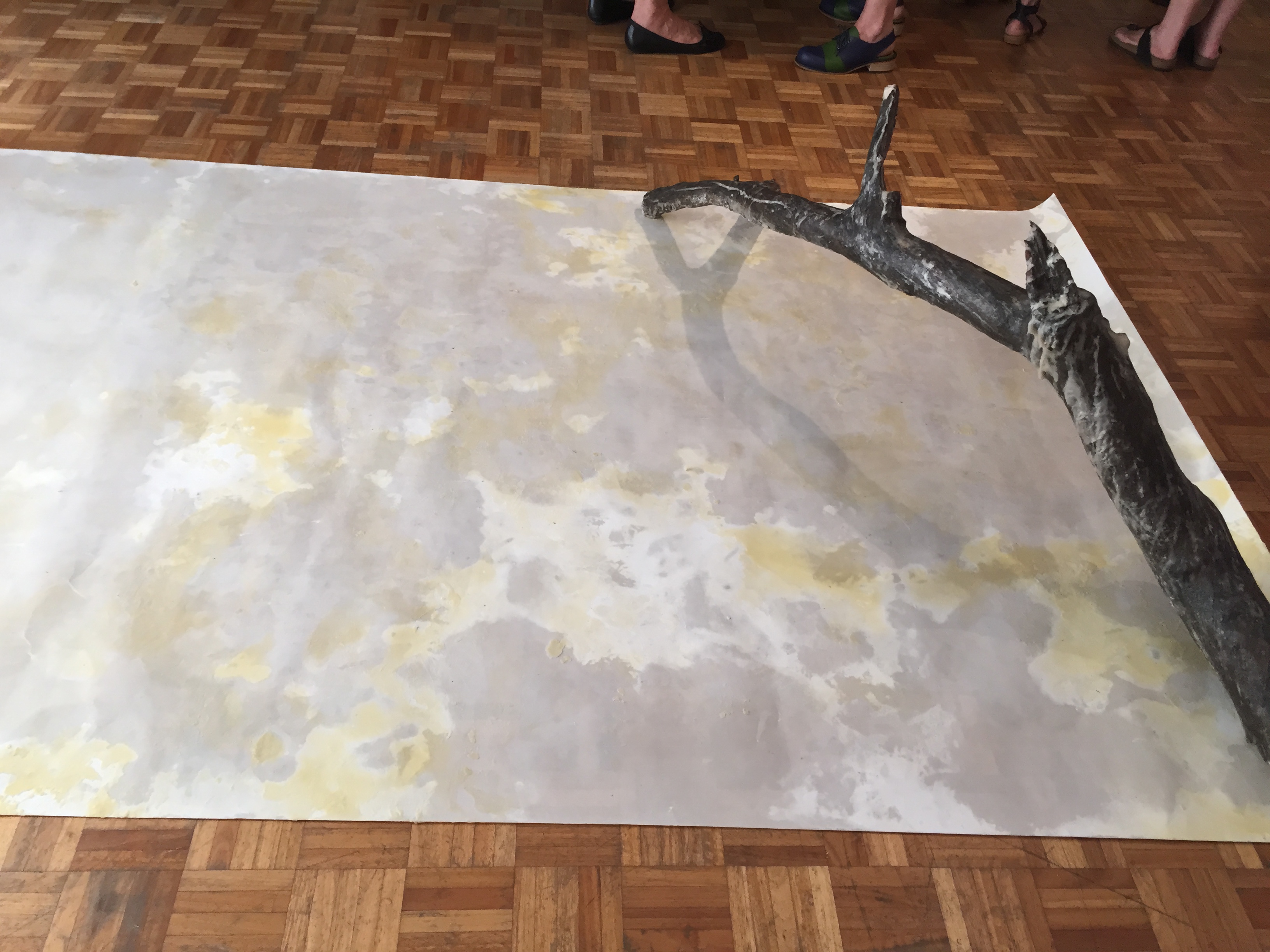
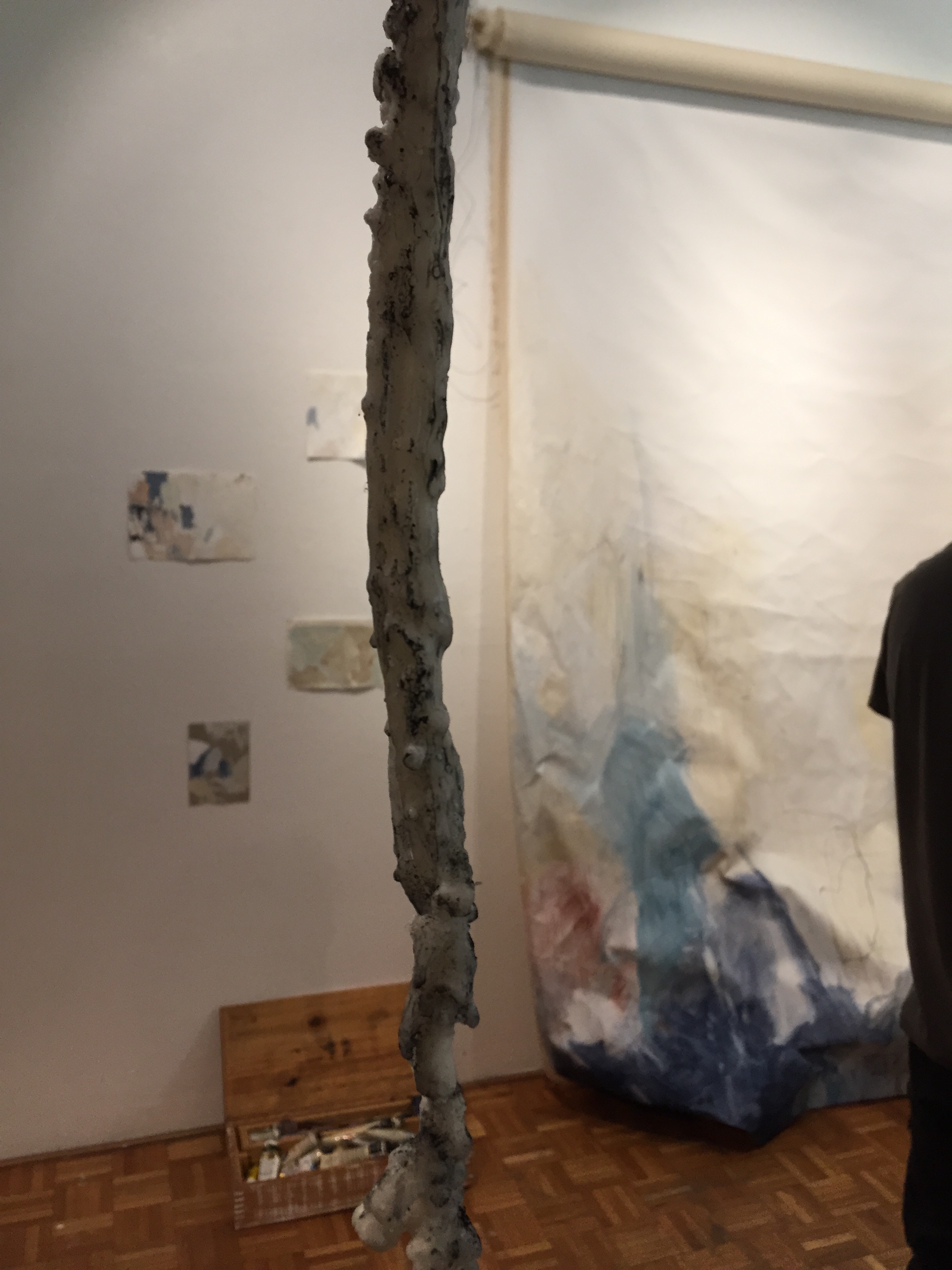
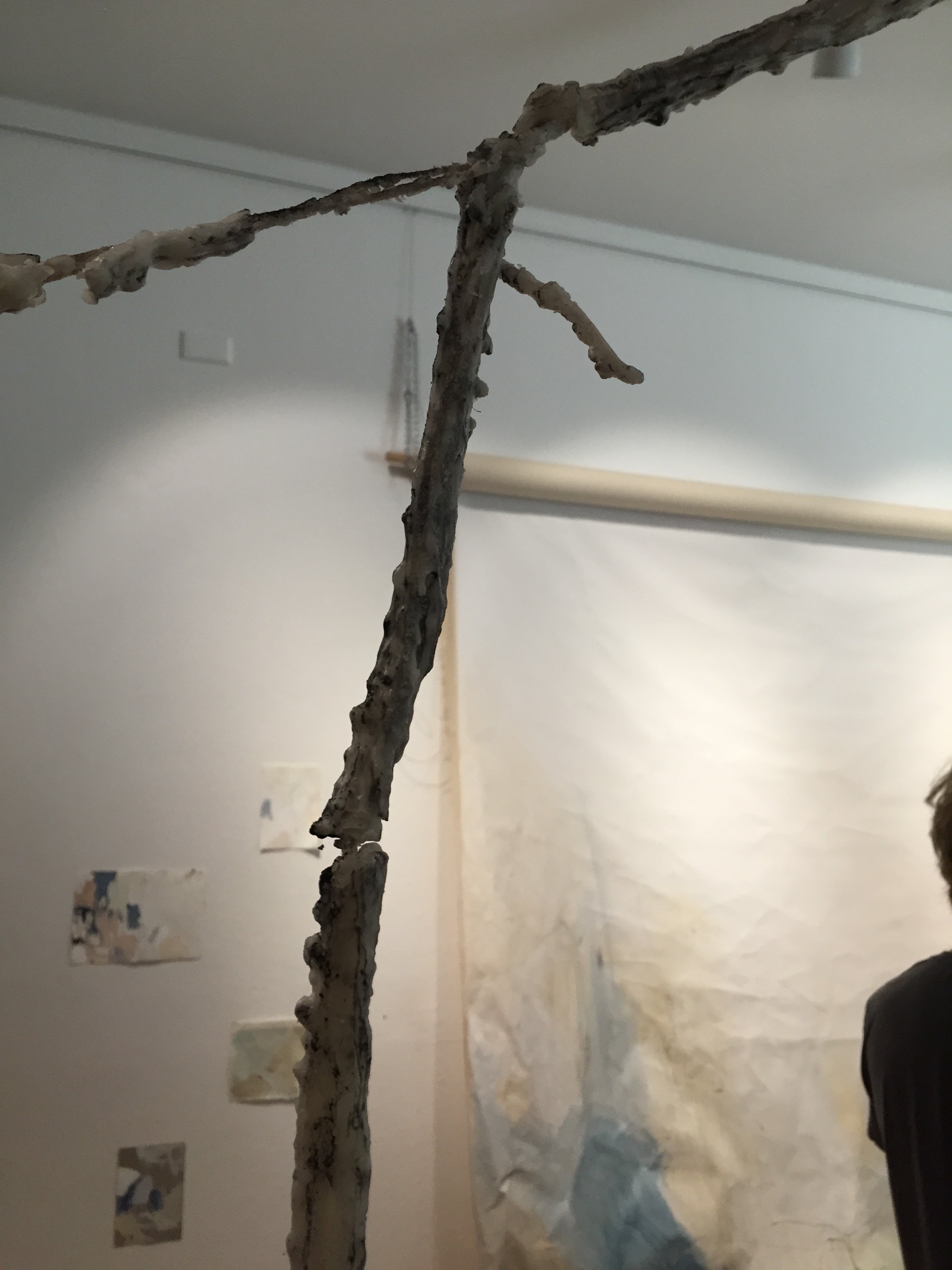
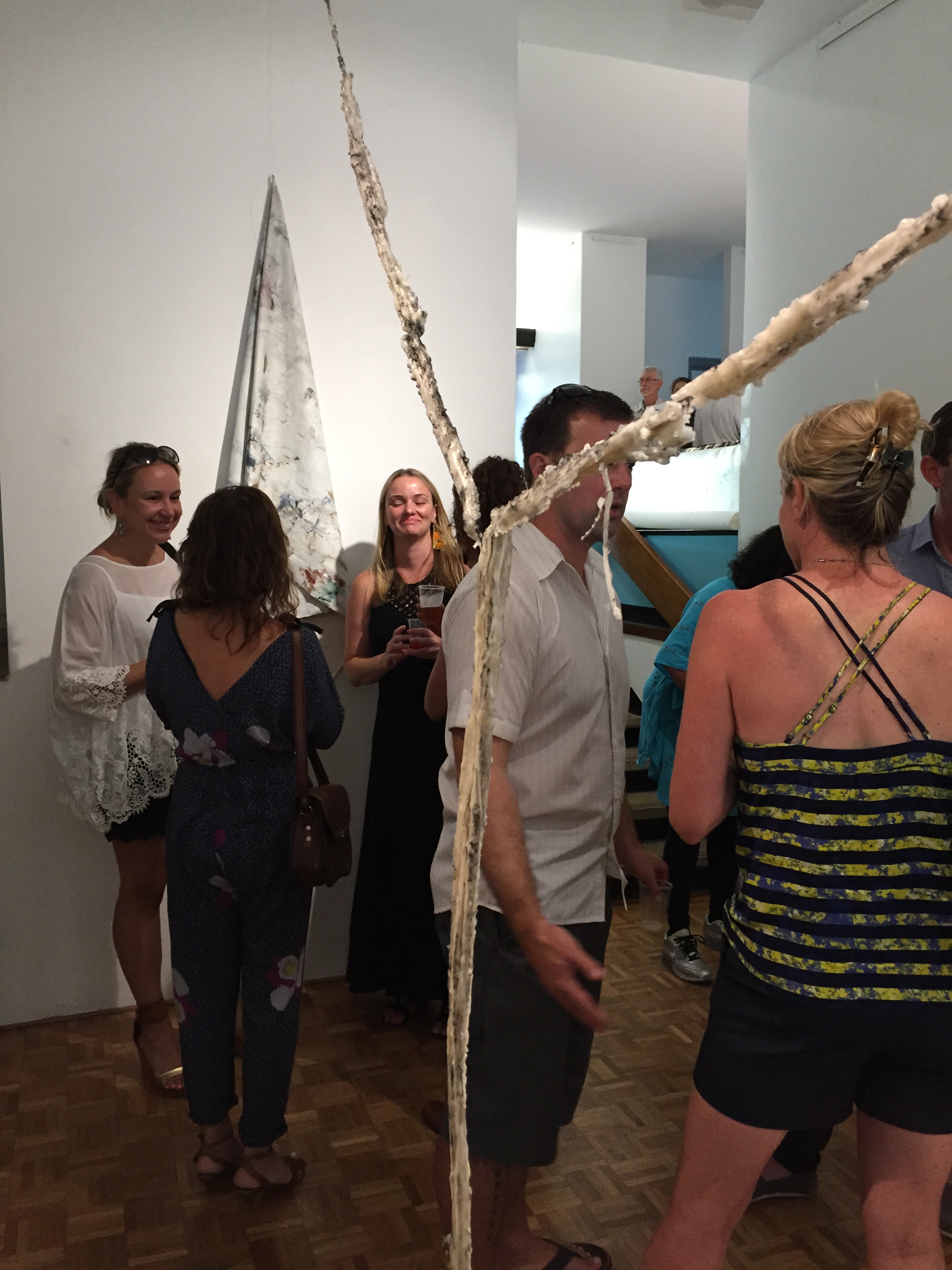
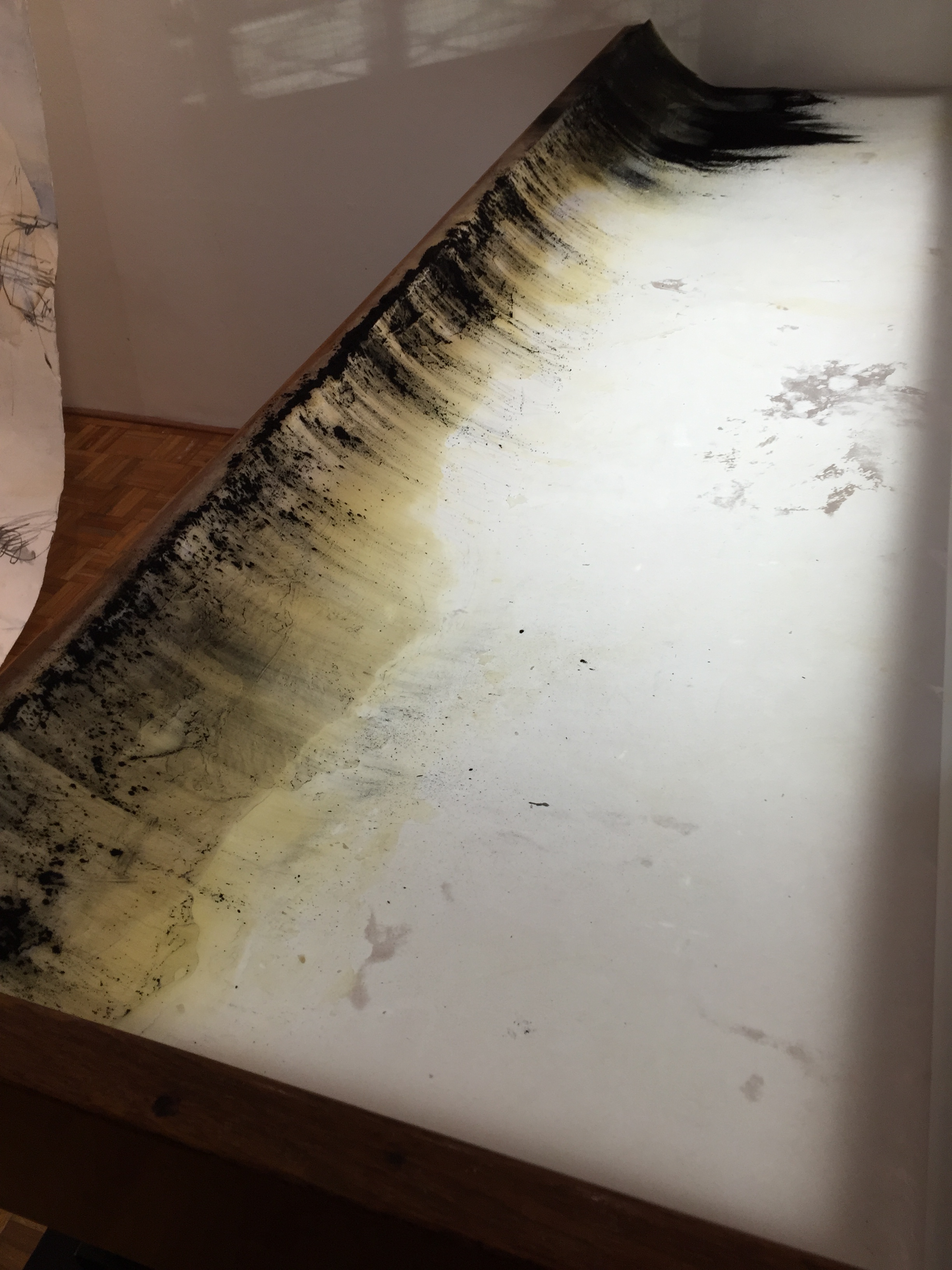
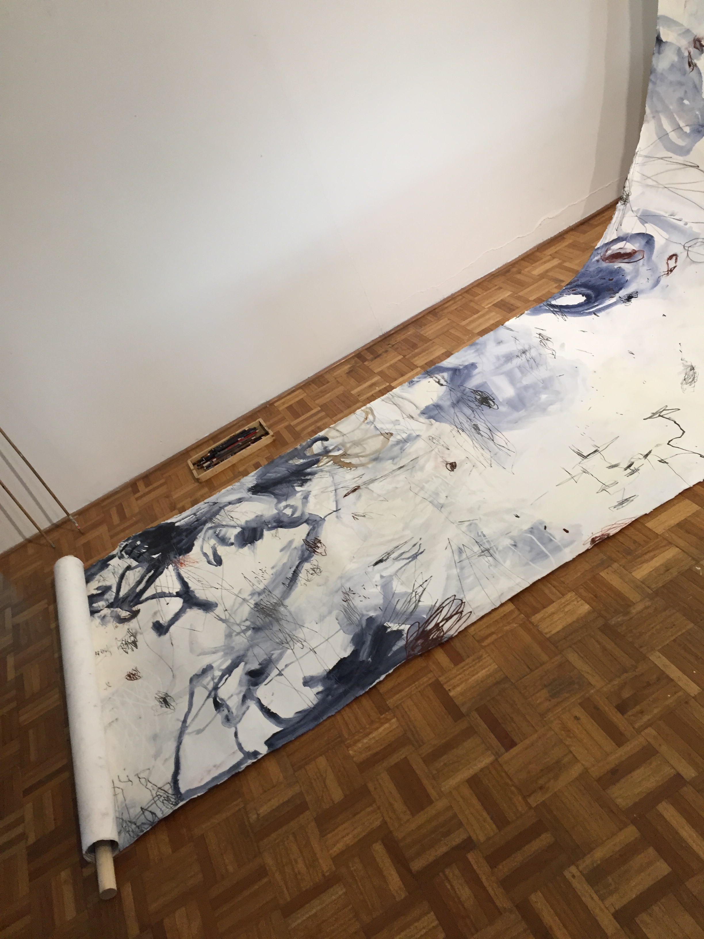
we went along to the Tracing Materiality exhibition on Sunday. the artists had been doing some continuous drawings on large rolls of paper, as well as wall drawings, and working with wax. I’m going to try make it to the talk on the 20th march too. I loved all the work! and there was a stack of drawing books for me to chase up also 🙂

—
event details via https://www.facebook.com/events/1668459076503049:
‘Tracing Materiality’ is a project and exhibition by Sydney based artists Gillian Lavery, Renuka Fernando and Kath Fries. Exploring expanded drawing practices that move beyond drawing as representation to focus on materiality and mark making. The artists’ process-based approaches are open-ended, improvisational and unfolding, taking place live within the gallery over the exhibition’s duration.
Opening night with the artists and MOST wrap party Sunday 6th March 6-8pm.
Exhibition open from 5th March to 20th March. Thurs- Sun 11am-4pm
Marrickville Open Studio Trail
Continuous Drawing
Saturday 5 & Sunday 6 March 2pm
Finissage & Discussion Panel
Sunday 20 March 2pm
For further information we will be updating our blog as the exhibition proceeds.
http://tracingmateriality.blogspot.com.au/p/continuous-drawing.html
For information about MOST http://www.marrickville.nsw.gov.au/most/
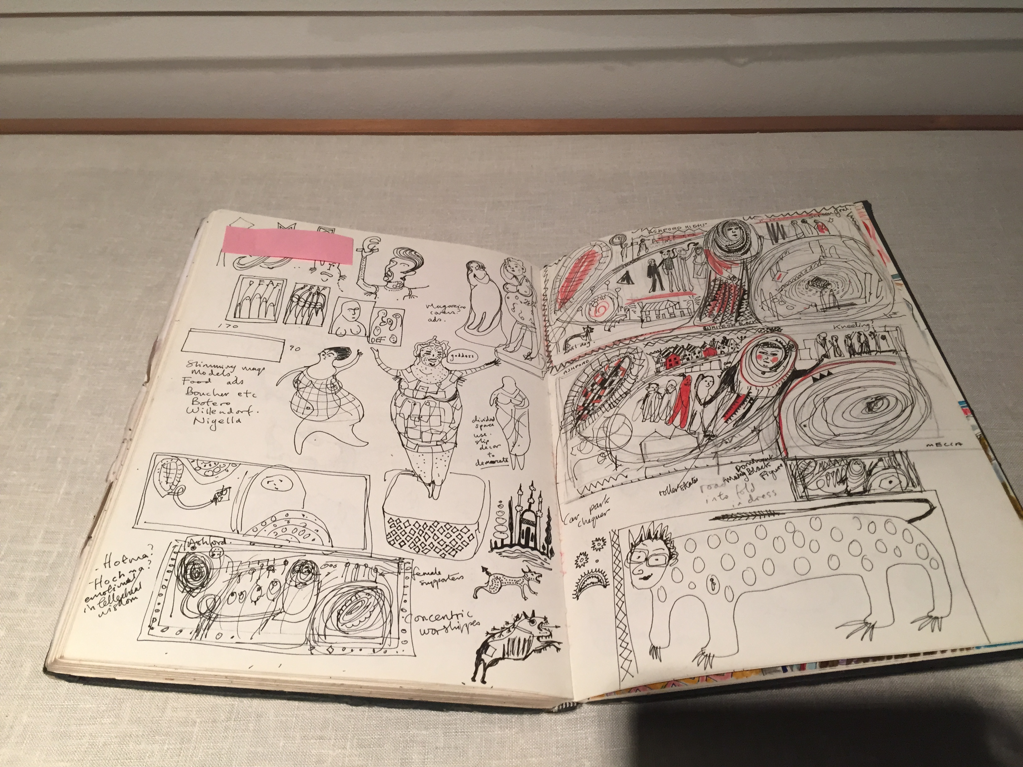
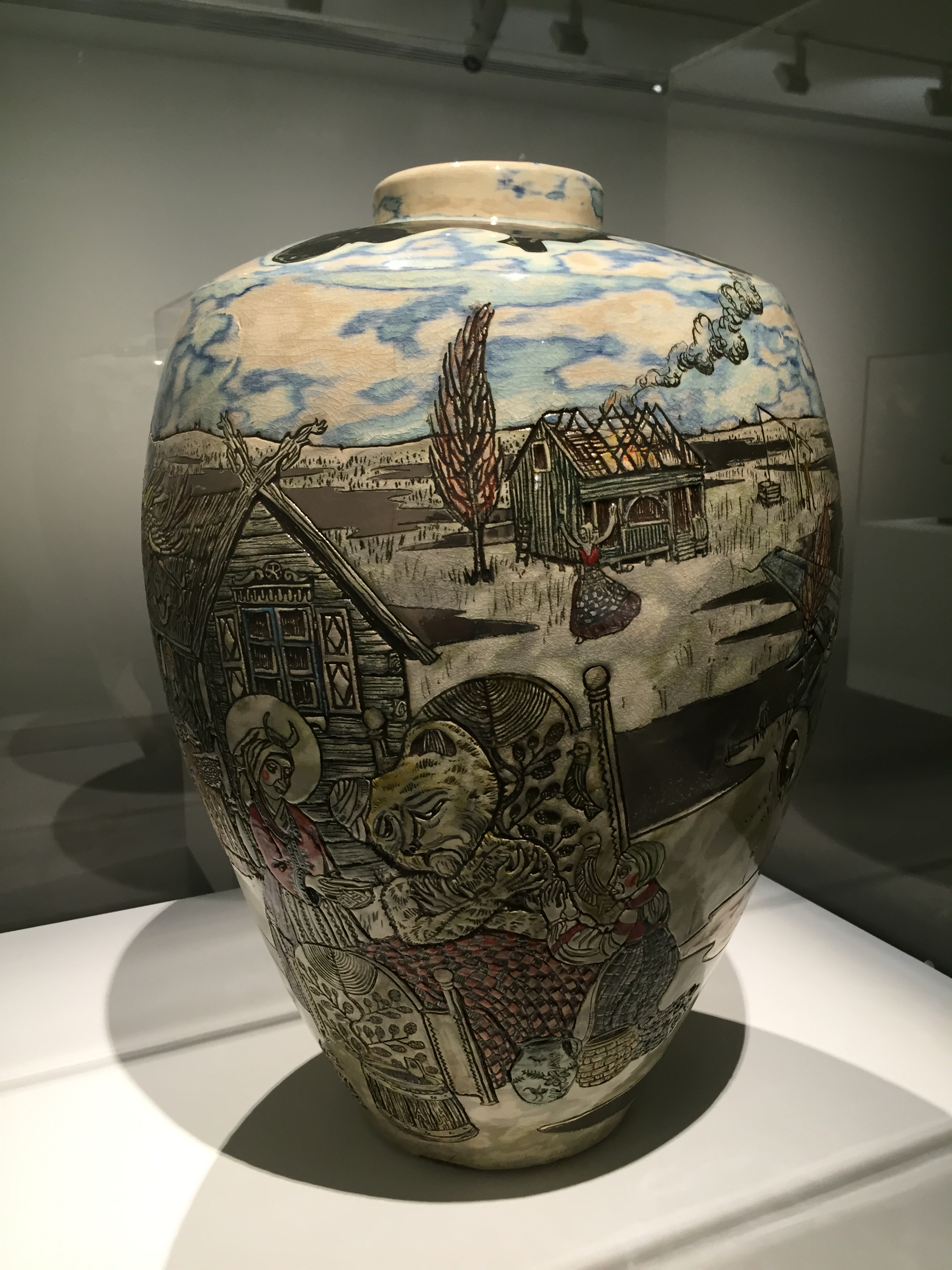
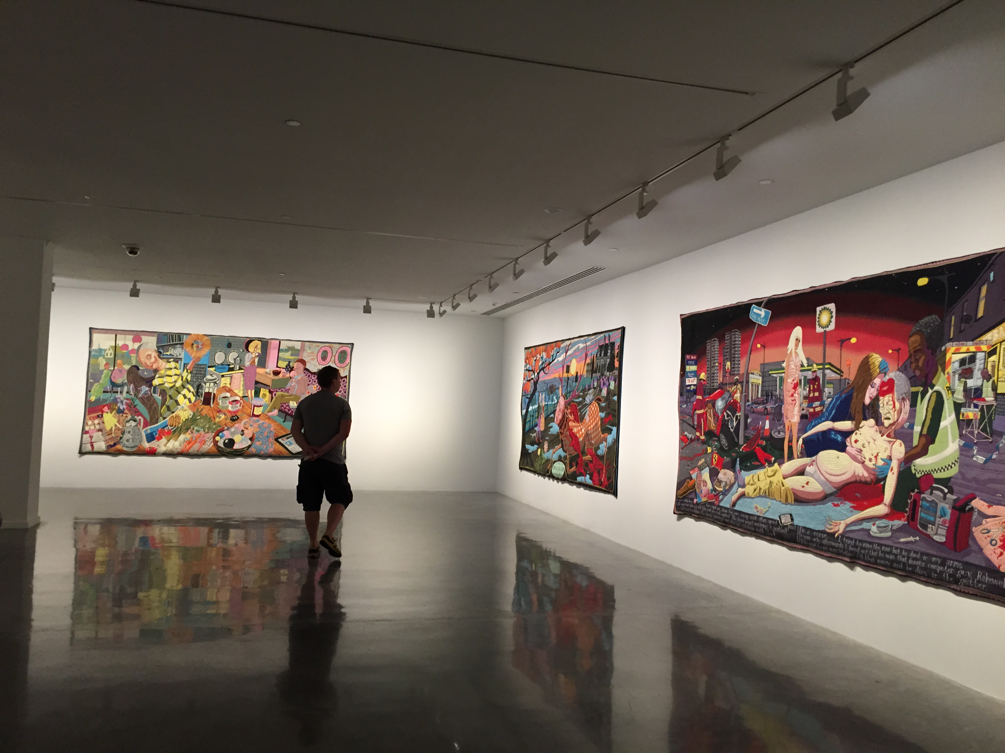
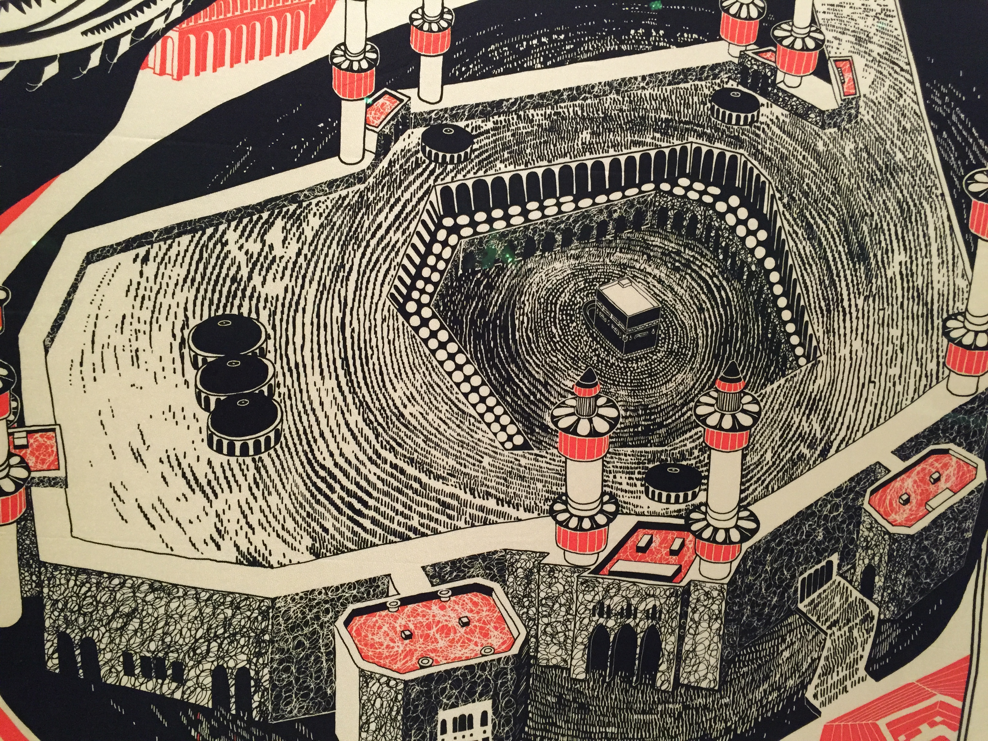
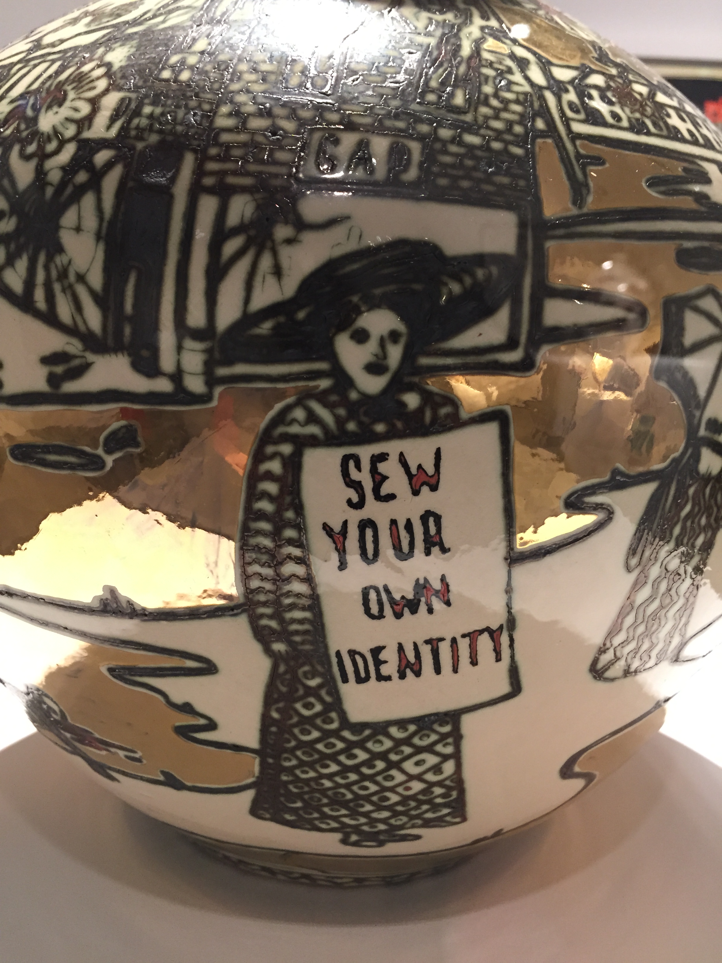
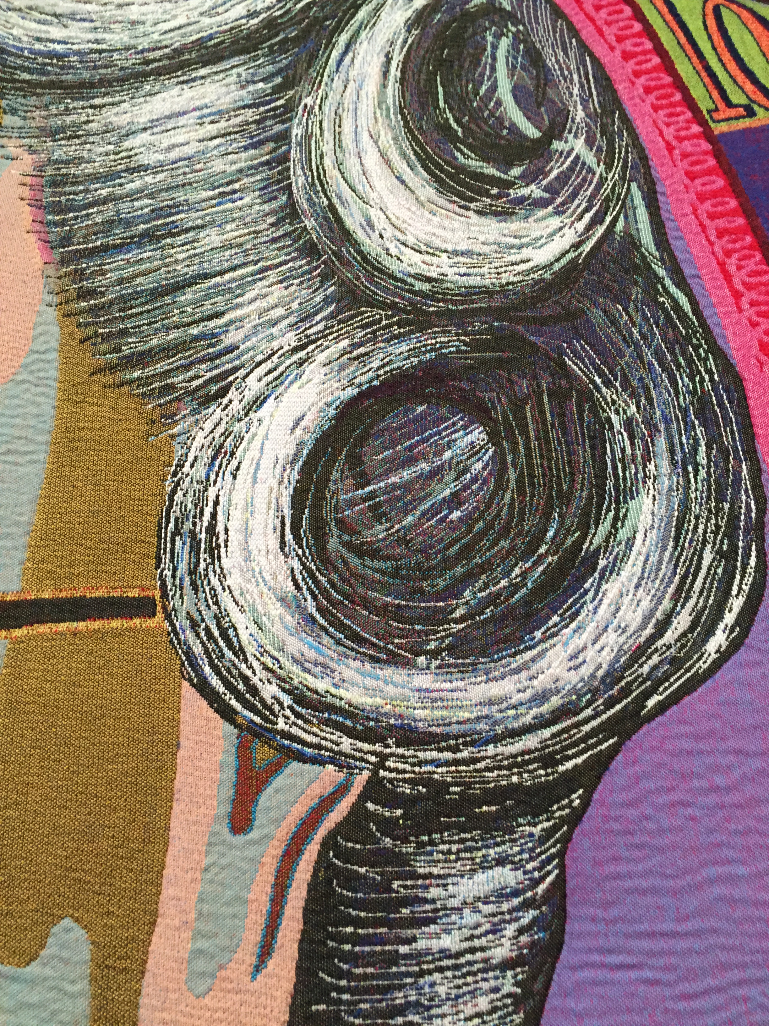
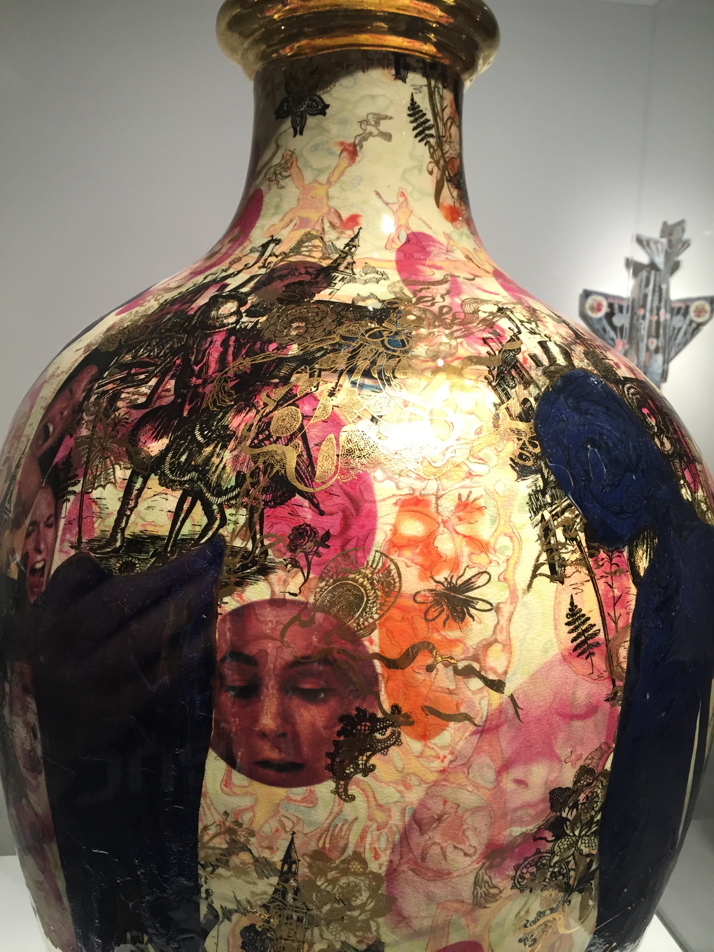
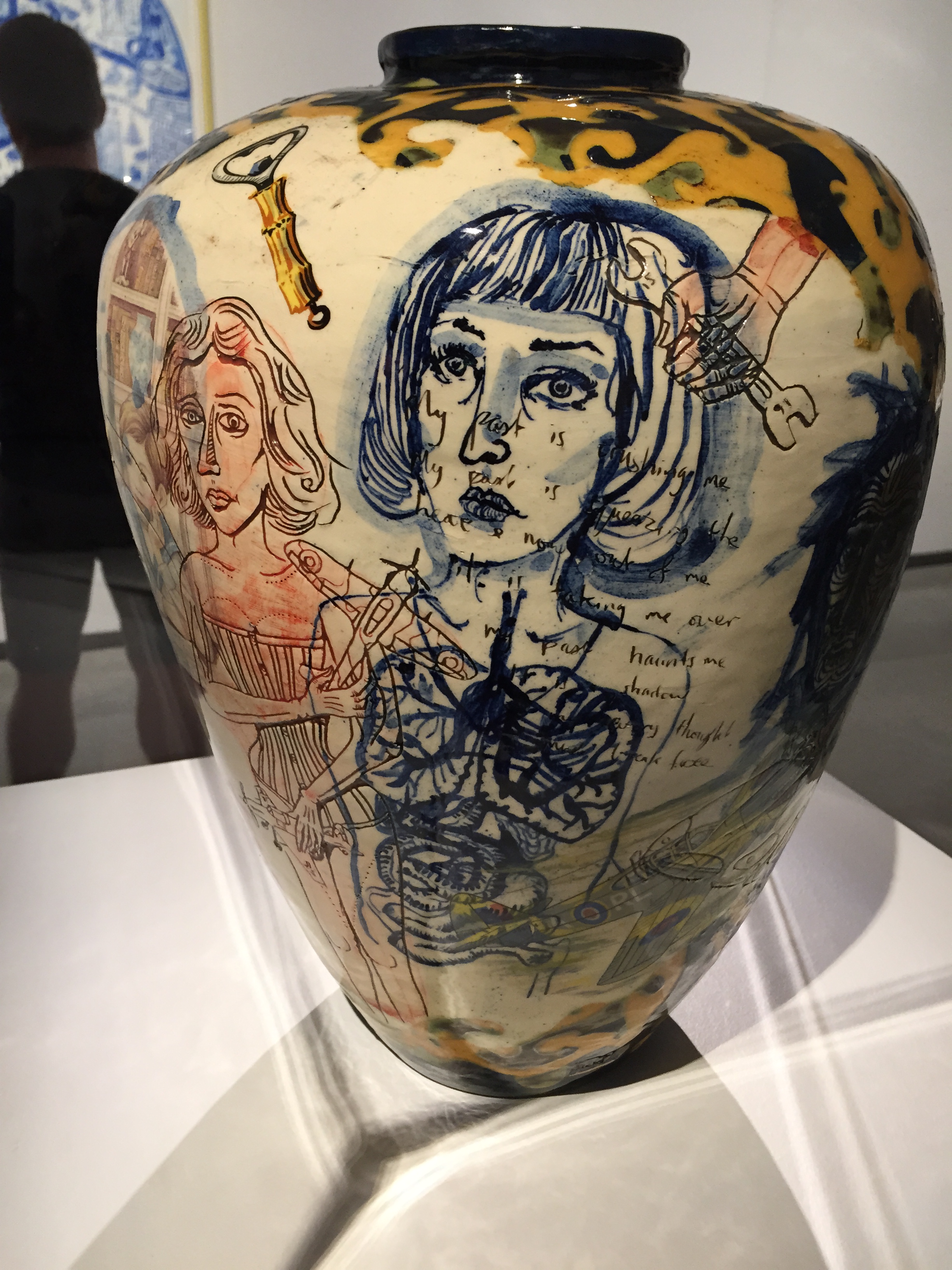
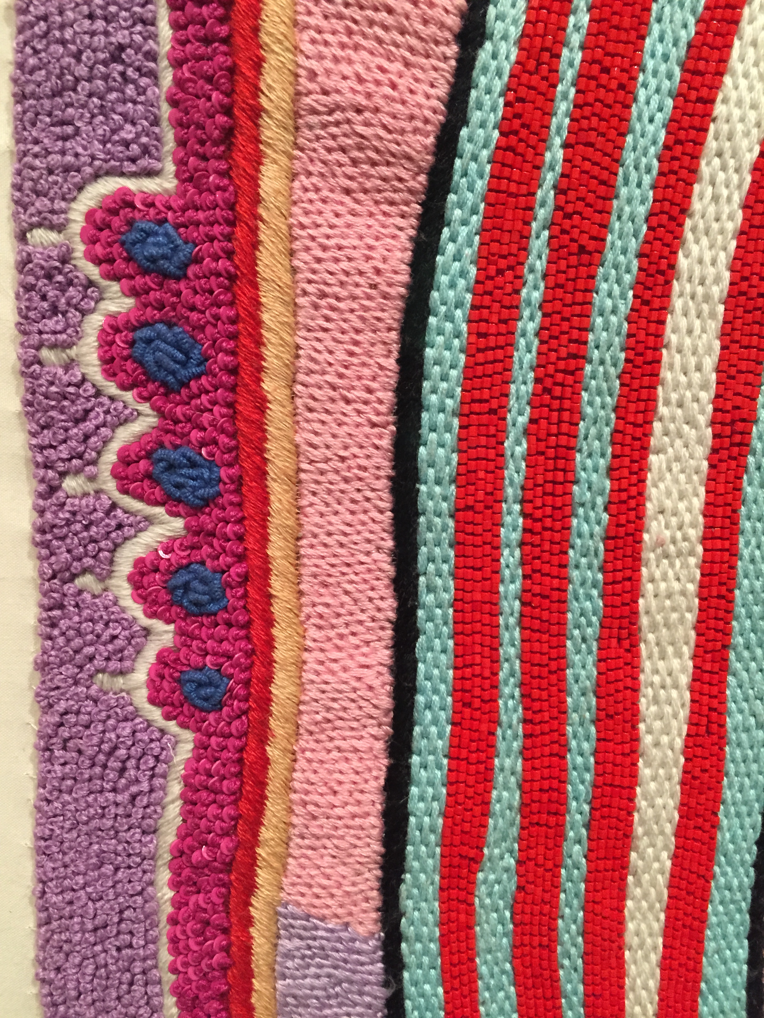
wow. I went to Grayson Perry’s “My Pretty Little Art Career” exhibition at the MCA today. he’s so prolific! and varied. there were pots/ceramics, paintings, tapestries, a digital room with interactive displays and screens plus his books and many others on ceramics etc., films, interviews, sculptures. I hadn’t seen his pots up close before – only images on occasion. I was thinking how great an example of collage they are – he has text, paintings, photographs, tradition patterning, modern styles mixed with the older styles. so layered! I was getting dizzy just walking around each one to see everything, and I think I missed looking at everything in detail and will need to go back again once I read through the catalog. loved the tapestries – the large ones were there – taking up long walls, and filling the room. such bright colours. I saw the ones from his tv series on social classes. my favourite was marked as a hand-embroidered piece, “Britain is Best”, which is quite substantial. so many French knots! and so neatly stitched. perfect rows. I also loved seeing some of the pages of his sketchbooks which were on display. I wish I could have seen more of these. he really seems to think in pictures, and add text notes, rather than making text notes with added images. it was great to see the preliminary sketches / ideas dump for one of the tapestries (from the tv series). loved his work, he really puts himself into the work, both in effort and as the subject. and I loved that Alan Measles, his teddy bear was featured quite often. as was Princess Diana. and Claire – even one of her dresses, and some photos. so much social and modern commentary and analysis in his work. loved the maps too – very intricate, and I could see some marks similar to Piranesi also. we were allowed to take pics too which was nice. some closeups below for things I wanted to remember in detail as great examples for inspiration.
yesterday, we went to the Piranesi exhibition at the State Library of Victoria. his work was amazing! such fine detail in his etchings and prints. there were around 100 works on display, but i found that I was transfixed by the close-up detail of his mark making in the works. when he was younger, the prints were lighter and later in his life he ran his own printmaking business and developed darker, denser prints of imaginative buildings, street scenes and maps. the exhibition included his visions of Rome etchings. most of the buildings did not actually exist outside his mind and works — they are imaginary buildings and cities. he showed amazing skill with depth of vision, fine detail in the clouds and architectural designs and showing darkness and light in the images. Giovanni Battista Piranesi lived from 1720-1778. a statement reported by one of his early biographers, via his Met Museum article shows his love for imaginary architecture:
“I need to produce great ideas, and I believe that if I were commissioned to design a new universe, I would be mad enough to undertake it.”
I tried drawing some of the marks in my notebook but found the pen i was using didn’t give me enough variation in the lightness and darkness of the lines.
I bought a copy of the book to look more closely at his lines and marks later. I’m afraid i didn’t notice all of the individual pictures from far away – I was too busy concentrating on a few of them close up. his mark making style was similar for most of his earlier and later works, but the large map that was printed onto the foyer outside the exhibition is of a more modern, draftsman drawing style.
the article in the paper about the exhibition mentioned that most of Piranesi’s works are held by libraries, rather than galleries. this is an interesting comment – perhaps due to his printing background, his works are highly regarded by printed works specialists. architects also study his works.
I made a knitted spoon for the upcoming “Spoons!” exhibition at The Slow Club. It’s called “A Spoonful of Threads” (original name was “nice and slow”). I was thinking of a slow / handmade theme – slow baking, stitching, knitting. I was going to do stitching but ended up knitting. it’s using three stitches — knit, purl and knit-from-behind, in random order to give the holes some texture. the wooden spoon is made of birch wood and I used red embroidery thread. it was a short callout—so I made it over the weekend. the exhibition runs from May 12-24th.
here is the call for submissions & here is the event page.
I had a listen to the first lecture of Grayson Perry – The Reith Lectures 2013 a couple of weeks ago. I loved his comments and disregard (?) of the artworld and his analysis of International Art English language.
since coming across this, I heard also that Grayson Perry and Brian Eno are working together. I can’t wait to see/hear what comes of this collaboration!
the BBC blurb:
“The award-winning artist Grayson Perry presents the 2013 BBC Reith Lectures, titled Playing to the Gallery. Across four programmes he discusses what makes him an artist, the limits of contemporary art, how to gauge the quality of new artworks and the future of the avant-garde.”
http://www.bbc.co.uk/podcasts/series/reith – podcasts of the lectures & related material
http://www.bbc.co.uk/programmes/b03969vt – Democracy Has Bad Taste: Grayson Perry: Playing to the Gallery: 2013 Episode 1 of 4
I see that the first lecture is also available on youtube
Grayson Perry- Reith Lecture No.1: Democracy Has Bad Taste http://www.youtube.com/watch?v=DtehJ3O3vMk
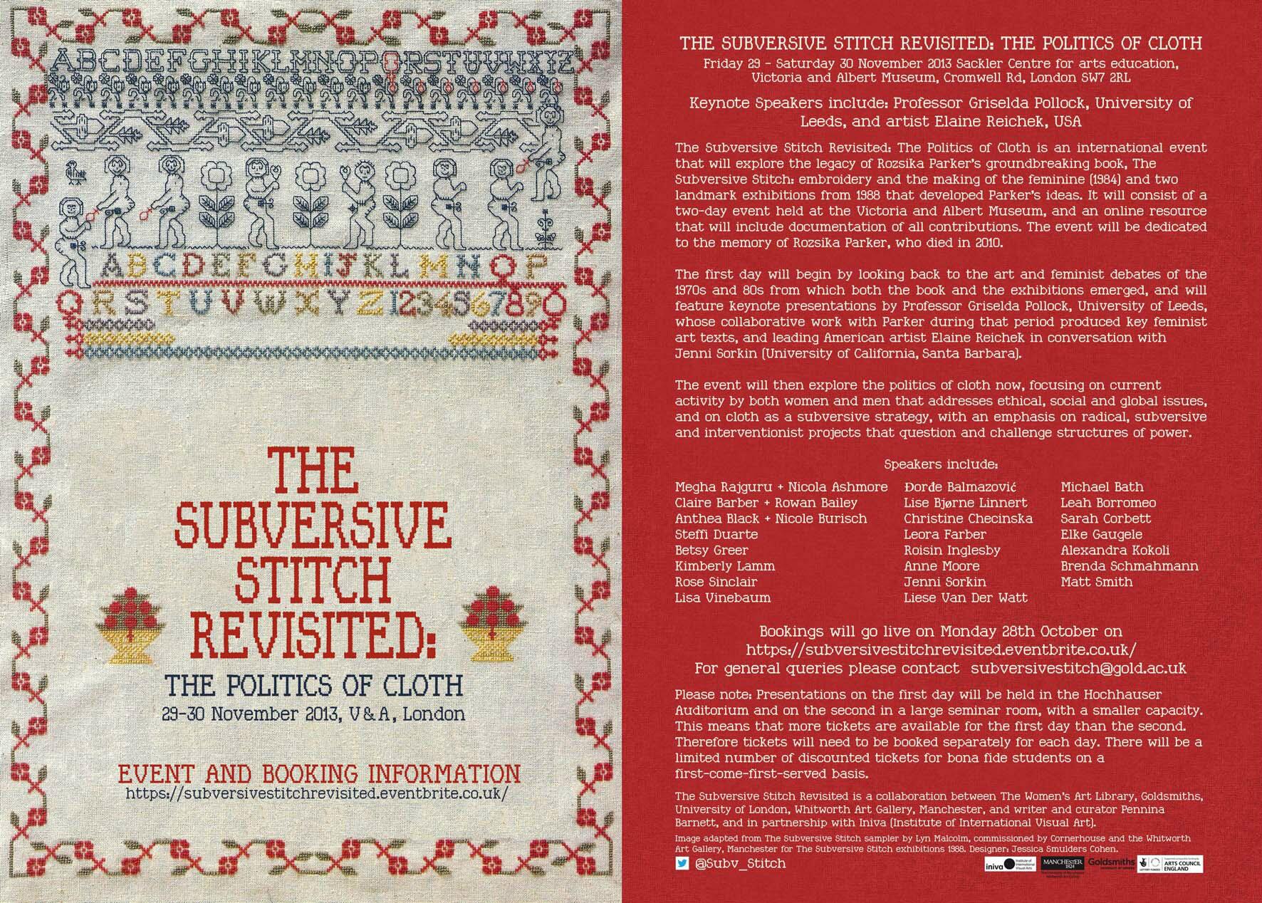
this weekend in the UK the “Subversive Stitch Revisited: The Politics of Cloth” conference was (is being) held. as it’s a bit far to go from Australia, I missed out on attending the lectures. their twitter feed mentions the sessions will be uploaded as podcasts soon, so I shall try to take a listen to them. I have a copy of the original book, “The Subversive Stitch: embroidery and the making of the feminine (1984)” by Rozsika Parker, though I have only browsed through it. I hope to read more over the Christmas break (along with Colour book).
here’s an image of the flyer:
event details, from the ticket site:
Keynote Speakers include: Professor Griselda Pollock, University of Leeds
The Subversive Stitch Revisited: The Politics of Cloth will explore the legacy of Rozsika Parker’s groundbreaking book, The Subversive Stitch: embroidery and the making of the feminine (1984) and two landmark exhibitions from 1988 that developed Parker’s ideas. It will consist of a two day event held at the Victoria and Albert Museum, and an online resource that will include documentation of the event. The Subversive Stitch Revisited will be dedicated to the memory of Rozsika Parker, who died in 2010.
Presentations taking place on Friday (29/11/2013) will reflect on the art and feminist debates of the 1970s and 80s from which the exhibitions emerged. It will feature keynote presentations by Griselda Pollock and American artist Elaine Reichek in conversation with Jenni Sorkin (University of California, Santa Barbara). Saturday (30/11/2013) explores the politics of cloth now, focusing on current activity by both women and men that addresses ethical, social and global issues, and on cloth as a subversive strategy.
Speakers and presenters include:Megha Rajguru + Nicola Ashmore, Đorđe Balmazović, Michael Bath, Claire Barber + Rowan Bailey, Lise Bjørne Linnert, Leah Borromeo, Anthea Black + Nicole Burisch, Christine Checinska, Sarah Corbett, Steffi Duarte, Leora Farber, Elke Gaugele, Betsy Greer, Roisin Inglesby, Alexandra Kokoli, Kimberly Lamm, Anne Moore, Brenda Schmahmann, Rose Sinclair, Jenni Sorkin, Matt Smith, Lisa Vinebaum, Liese Van Der Watt.
today I went to the Art Gallery of NSW and saw “The Sydney Moderns” exhibition. I loved the “colour music” works of Roy de Maistre – I think these would translate well to textiles. like weaving sounds and colour. he did a lot of work based on synaesthesia. I was at the gallery with my sister and 10 month old niece, who was very excited – singing and dancing in the gallery – so we walked quickly through the exhibition so as not to disturb others viewing the works. I hope to go back and see it again and spend some more time looking at the paintings. De Maistre also did some paintings based on the colour wheel.
from Roy de Maistre’s wikipedia page:
“He developed an interest in “colour-music”, the relationship of colour harmony to musical harmony. With his ordered, analytical mind, he applied the theory of music to painting. He worked with Adrian Verbrugghen, and then Roland Wakelin to devise a “colour-music” theory. In 1919 he held a joint exhibition with Roland Wakelin titled Colour in Art to expound his theories. In this, at the time controversial. art exhibition the musician-turned-painter had chosen colours to harmonise like the notes in music. This “colour-music” exhibition became part of Australia’s art-folklore as “pictures you could whistle”. Influenced by earlier exponents of “colour-music” theory in Europe and America, this exhibition has since been identified as the earliest experiment in pure abstractionism in Australia. His colour charts, showing musical notes corresponding to different hues, are now owned by the Art Gallery of New South Wales, with “colour music” gaining a permanent place in Australian art history.”
reading ahead, I think some of his works might be useful for inspiration for some of the forthcoming assignments. I could try make a painting inspired by his colour wheel & paintings also, as well as some textiles based on the paintings and studies.
also reading about Anne Dangar and Grace Crowley and their geometric works
http://www.artgallery.nsw.gov.au/education/education-materials/education…
http://www.artgallery.nsw.gov.au/collection/works/OA17.1960/
http://www.artgallery.nsw.gov.au/collection/works/WA2.1969.a-b/
http://www.artgallery.nsw.gov.au/exhibitions/sydney-moderns/
http://home.vicnet.net.au/~colmusic/welcome.htm
http://home.vicnet.net.au/~colmusic/maistre.htm
http://home.vicnet.net.au/~colmusic/maistre3.htm
http://home.vicnet.net.au/~colmusic/maistre4.htm
http://creativegames.org.uk/modules/Art_Technology/Synaesthesia/color_mu…
http://www.academia.edu/688466/Colour_Shape_and_Music_The_Presence_of_Th…
http://trove.nla.gov.au/result?q=roy+de+maistre
http://trove.nla.gov.au/result?q=%22roy+de+mestre%22
http://trove.nla.gov.au/result?q=%22grace+crowley%22
http://trove.nla.gov.au/result?q=%22anne+dangar%22
pictures:
roy de maistre
anne dangar
grace crowley
roland wakelin
Today I went to the “Landlock” exhibition at the Casula Powerhouse.
Landlock explores a parallel relationship between Afghanistan and Australia: one is geographically defined by surrounding land mass; the other, completely surrounded by sea. The exhibition aims to highlight that such differences have produced a shared dialogue about the political, social and physical environment occurring between the two regions.
Artists include: Khadim Ali, Rusdi Anwar, Sanaz Fotouhi, Andrew Garton, Nasim Nasr and Amin Palangi
photos I took at the exhibition
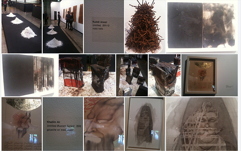
I loved the work with rust, and the patterns printed onto the cardboard boxes, with the stories of women encoded in these.
the Shaun Gladwell exhibition of his war paintings was held at the gallery concurrently – this was also interesting to see.