Category Archives: mark making

Tracing Materiality exhibition

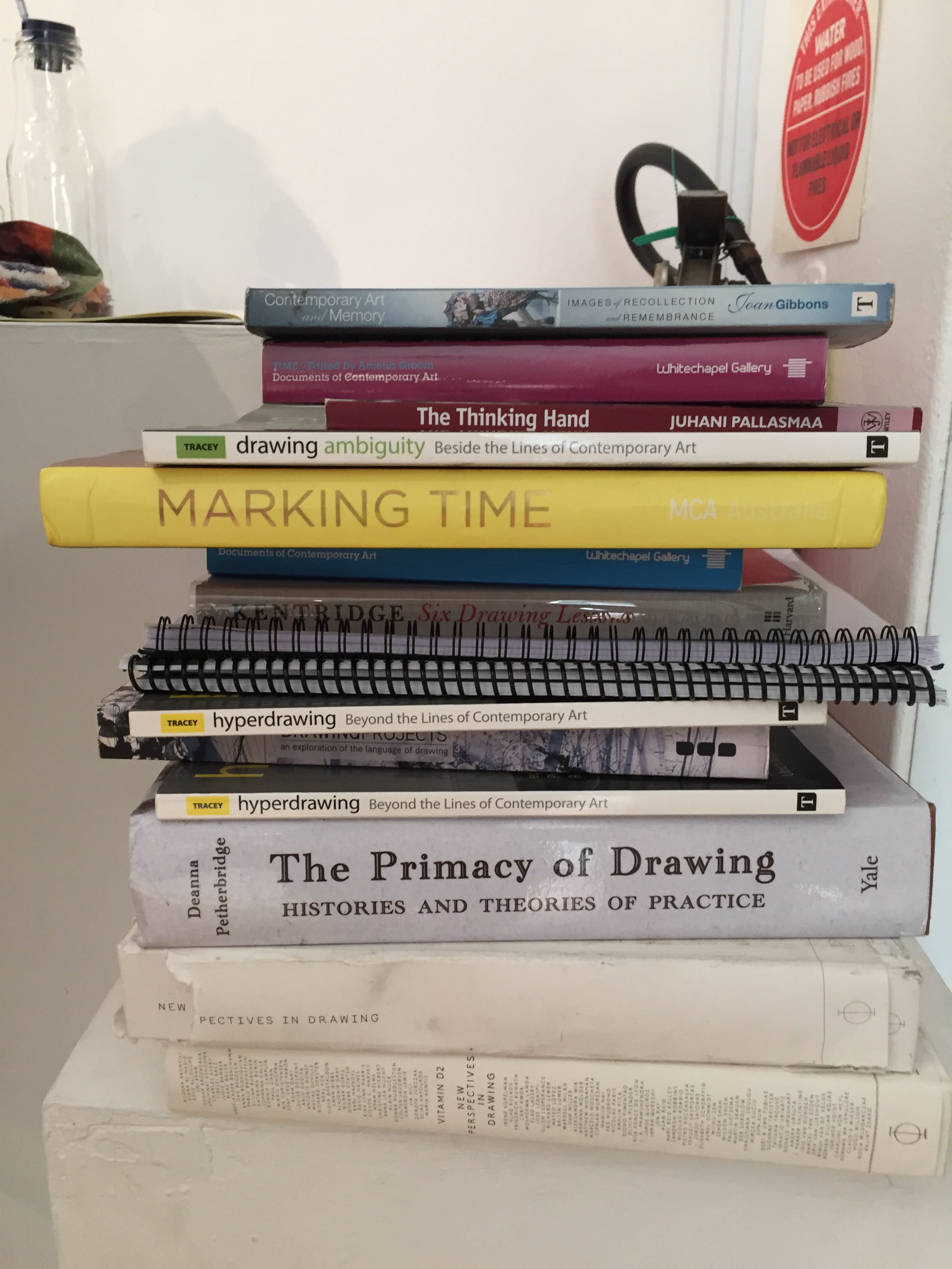
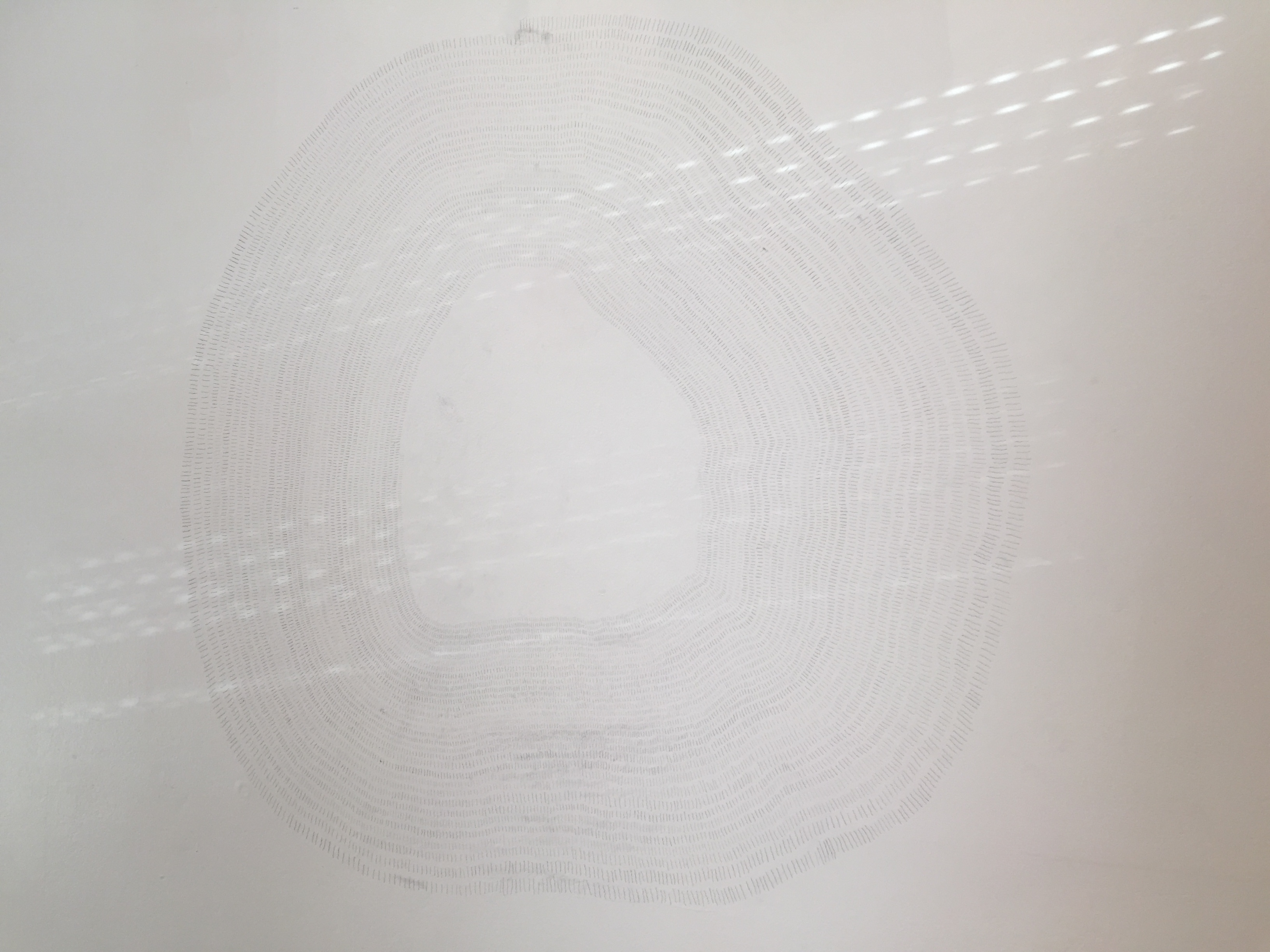
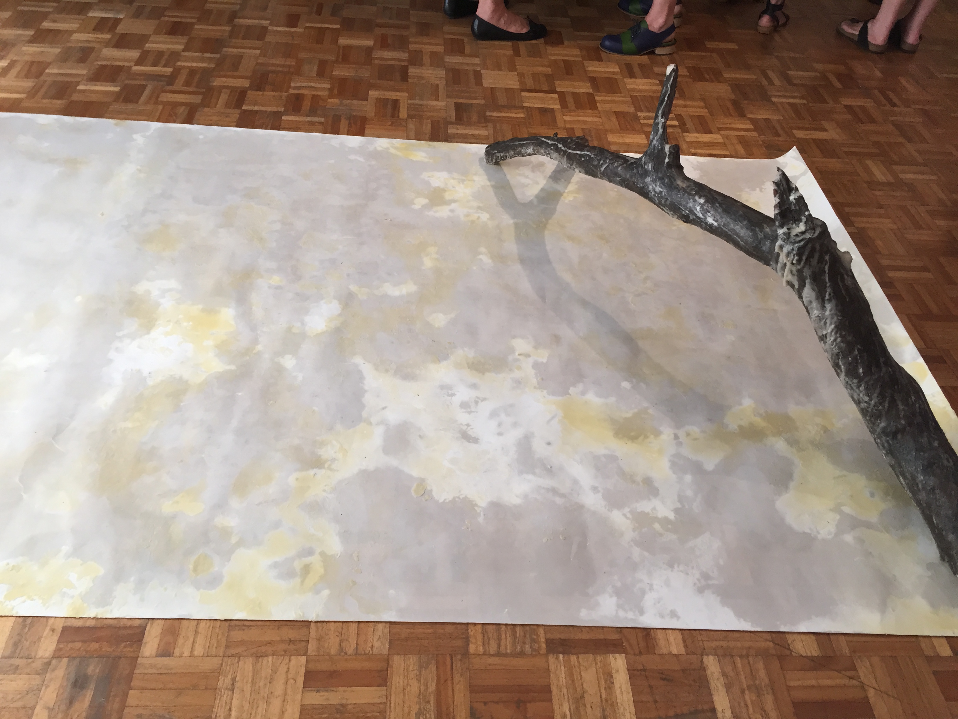
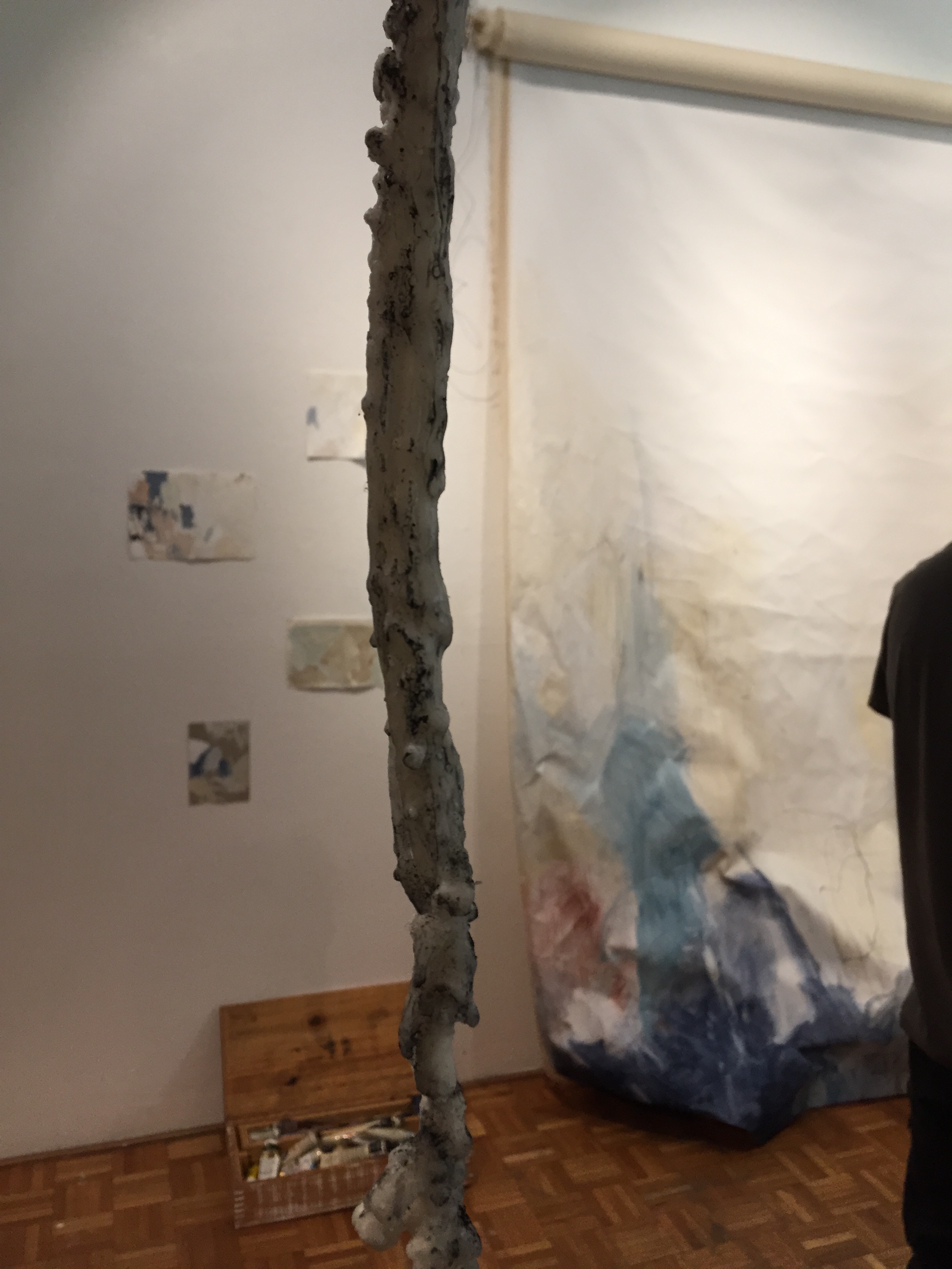
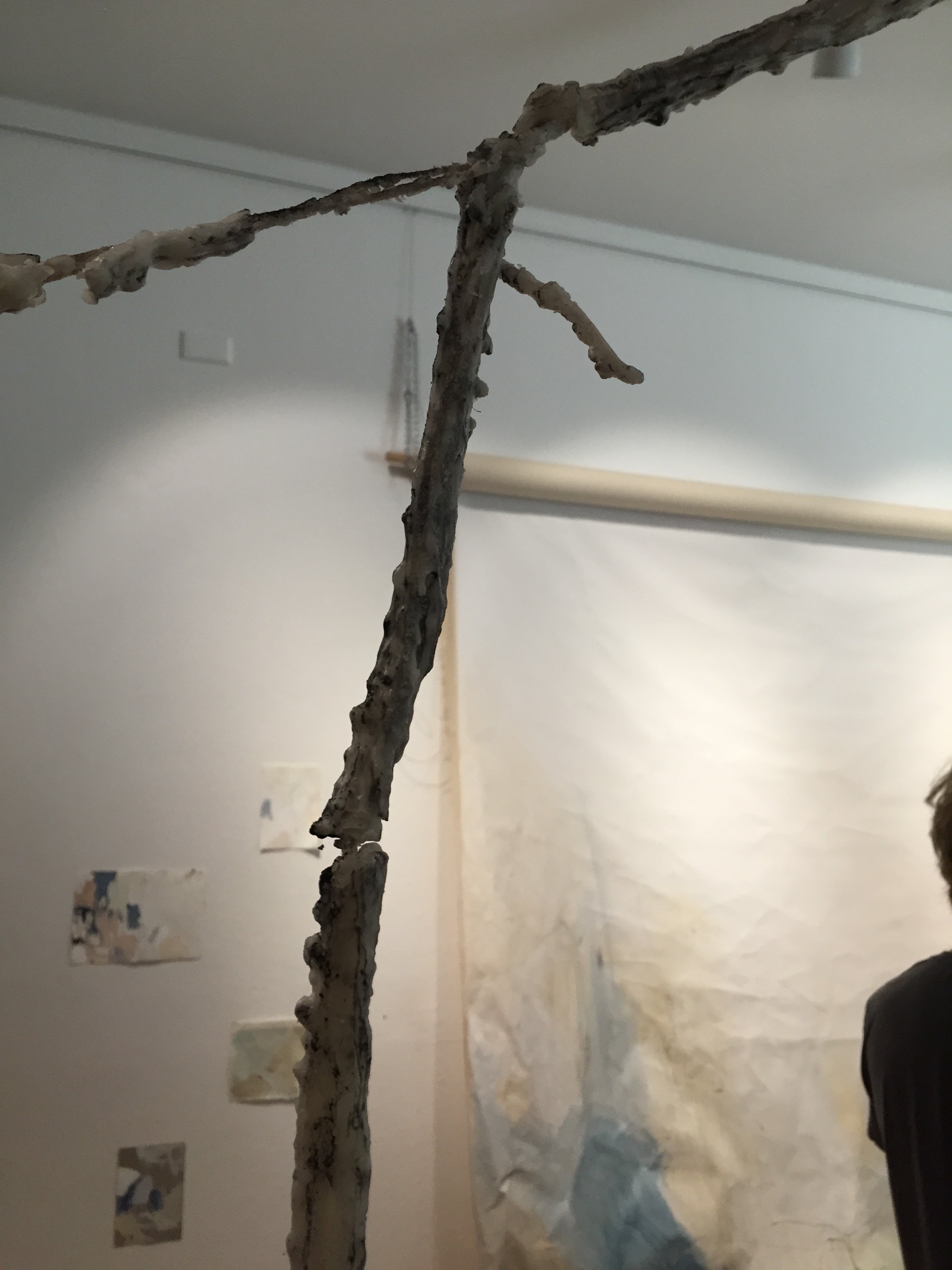
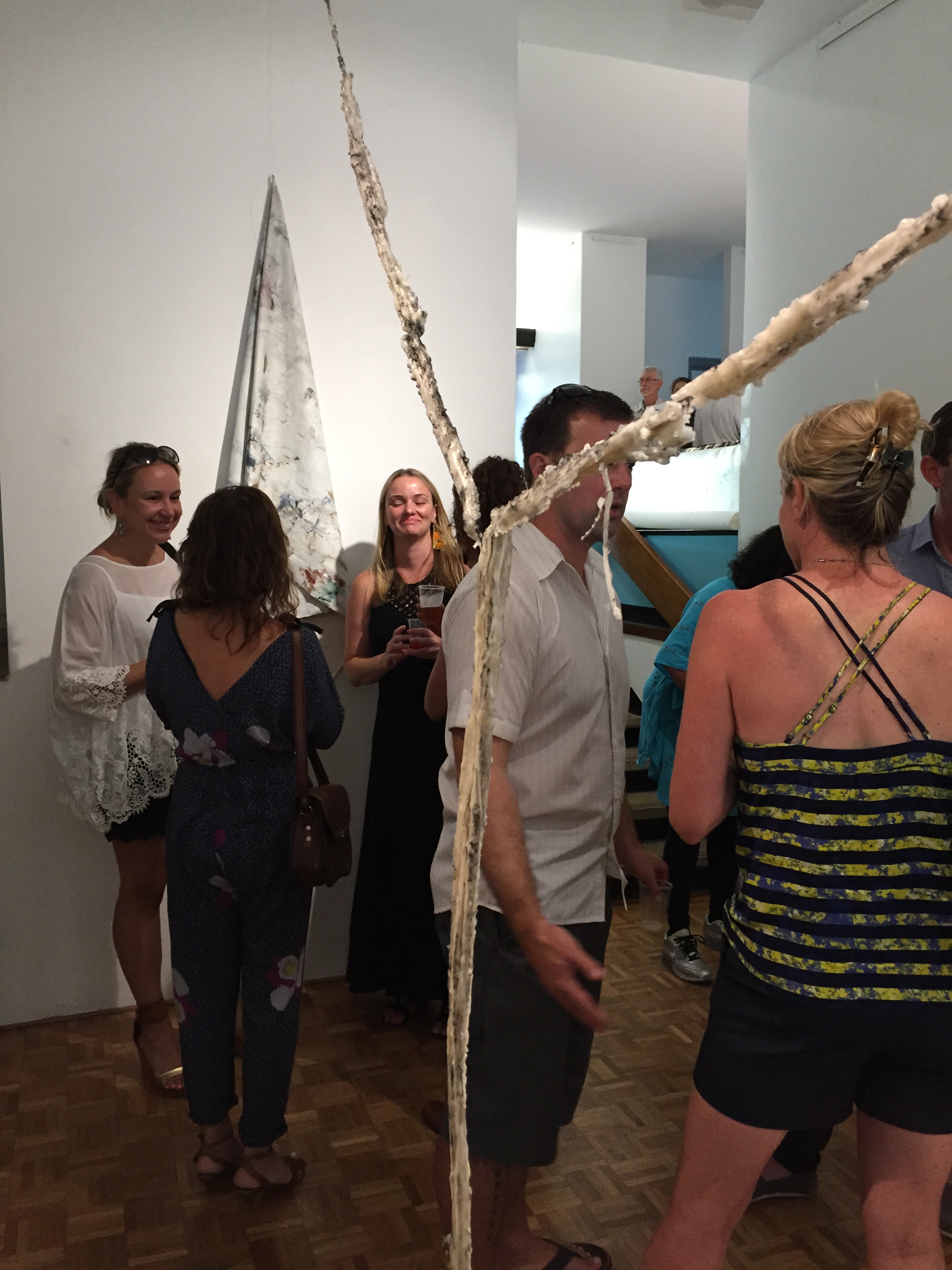
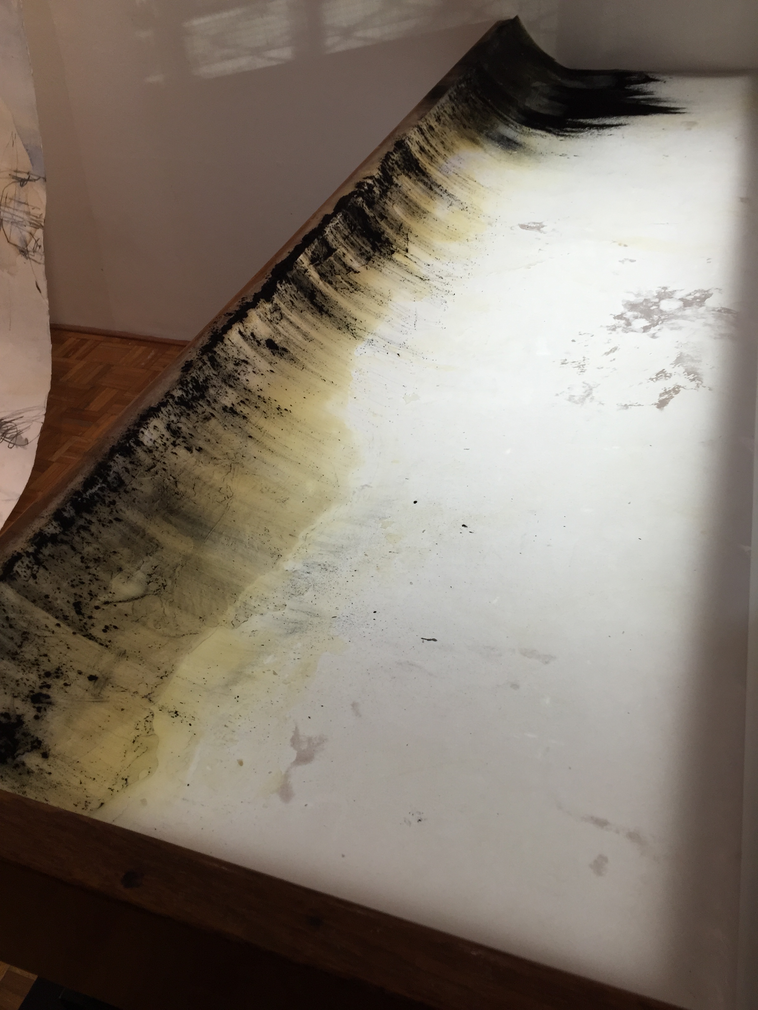
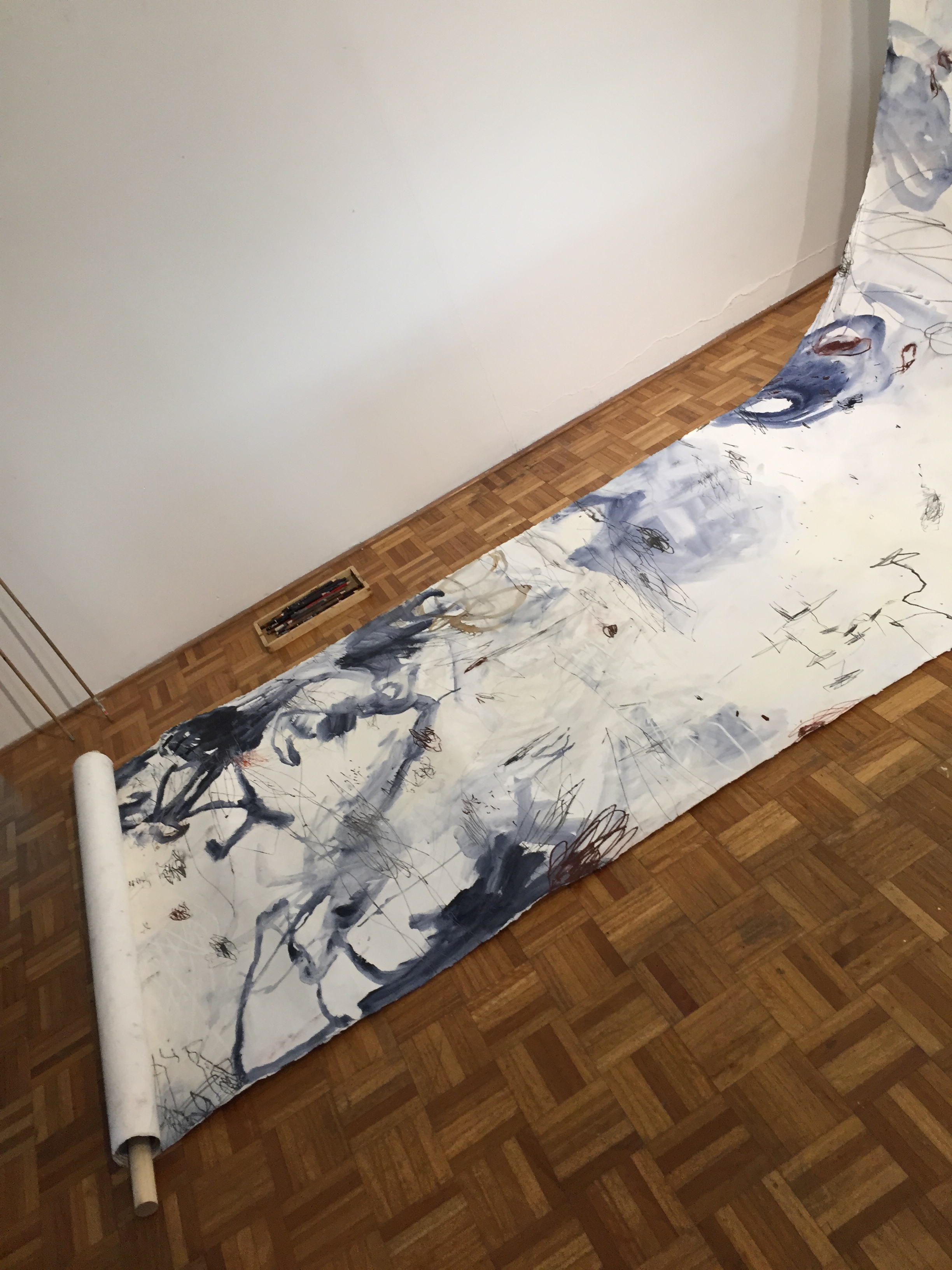
we went along to the Tracing Materiality exhibition on Sunday. the artists had been doing some continuous drawings on large rolls of paper, as well as wall drawings, and working with wax. I’m going to try make it to the talk on the 20th march too. I loved all the work! and there was a stack of drawing books for me to chase up also 🙂

2016-03-06 18.23.18

2016-03-06 18.23.32

2016-03-06 18.23.42

2016-03-06 18.23.46

2016-03-06 18.25.32

2016-03-06 18.25.35

2016-03-06 18.25.39

2016-03-06 18.34.44

2016-03-06 18.34.49

2016-03-06 18.34.52


event details via https://www.facebook.com/events/1668459076503049:

‘Tracing Materiality’ is a project and exhibition by Sydney based artists Gillian Lavery, Renuka Fernando and Kath Fries. Exploring expanded drawing practices that move beyond drawing as representation to focus on materiality and mark making. The artists’ process-based approaches are open-ended, improvisational and unfolding, taking place live within the gallery over the exhibition’s duration.

Opening night with the artists and MOST wrap party Sunday 6th March 6-8pm.
Exhibition open from 5th March to 20th March. Thurs- Sun 11am-4pm

Marrickville Open Studio Trail
Continuous Drawing
Saturday 5 & Sunday 6 March 2pm

Finissage & Discussion Panel
Sunday 20 March 2pm

For further information we will be updating our blog as the exhibition proceeds.
http://tracingmateriality.blogspot.com.au/p/continuous-drawing.html

For information about MOST http://www.marrickville.nsw.gov.au/most/

finding a line

I sat down again to my stitch noodling frame today to relax and play and tried some thinner cotton. this time double stranded sewing thread. tried some button hole stitch — still my favourite ever since discovering Junko Oki’s work — especially her circles, last year. the first row is a row of straight edged button hole stitch. for the second row, I noticed the thread was settling into the fabric in a more organic way, not wanting to stick to the straight line. so I let it go, and it made this really nice organic, jagged line which I really like. it’s a bit closer to an open (loose) cretan stitch, but also looks more like a heartbeat, or simple audio waveform. sometimes it’s worth letting go of your plans to find the better line.

draw what you see and not what you know

I’m reading “Drawing Projects – an exploration of the language of drawing” by Mick Maslen and Jack Southern as recommended by Sandra Flower, one of the OCA Textiles tutors. it looks like a very thorough book with some theory as well as many practical examples and exercises and analysis of artists’ work. at the start of the book is as section “What we know and what we see”. whilst this might seem to be a basic, easy concept, it’s one that I have forgotten so am including a couple of quotes here.

prior to this, the authors talk about how children draw what they see – “the drawing incorporates the child’s knowledge and experience [of the pond] as a whole body experience perceived through all of their senses, and not just through their eyes, or from a single point of view. In some ways, this is children’s drawings at its best, and perhaps it exemplifies something of what Picasso was searching for when he is reputed to have said that he had spent 80 years learning to draw like a child.” (page 10).

later, as the child becomes older, they learn more words and concepts and then (perhaps) start thinking their drawings are not perfectly matching reality, so they stop drawing. “Unfortunately most adults’ drawing skills do not develop beyond those of the young adolescents who gave up drawing. The world is full of educated people who, it is assumed, see the world as sophisticated adults, but draw like adolescents.” (page 11). I can relate to this! I stopped drawing after grade 10 art class, which was a very long time ago.

“When we are making drawings, we must learn to use ‘what we know’ selectively, and only when it helps us to communicate a clearer understanding of what it is we are attempting to describe in the drawing. Students are continuously told by their teachers to ‘look more carefully’, and to ‘draw what you see and not what you know’. The most common mistake we make is to draw our limited and ill-conceived knowledge as a pre-conceived fact, and in this case we are making it up from what is probably our poor and limited visual memory. As a general rule, it is always better to look very carefully, and draw what you see. Not looking intently enough usually results in using generalised and ‘unseen’ information that has been conceptualised and become fixed.” (page 22)

this is something I was coming to the realisation of when I made notes for my previous post on sketching and seeing.

artgraf bee

I’ve been trying out my new artgraf water soluable graphite tonight with another drawing of a bee for my theme. I think it’s sometimes called watercolour graphite. I put water in the lid and found my paintbrush and tried it out. I haven’t got the bee shapes right yet but I love the variations in lightness and darkness of the graphite. there’s even a slight shimmer and sparkle to it in this dim light. will see if it’s still there in the morning daylight.

I shouldn’t have tried the background wash though.. 🙁 don’t like it atm

another in (hotel room) biro practicing hatching (with wonky bee shape still)

footpath shapes drawings

another exercise I learned from one of Carla Sonheim’s classes, is to practice seeing shapes — animals and other things, in the cracks and lines and shadows on the footpath and other places. I think this might be a type of pataphysical drawing exercise too.

collating some of them here — most a “imaginary animals” or “blobimals” as it’s fun to draw them, and they seem to be everywhere once you start looking! it’s like finding animals in the clouds.

some I’ve done:

and some shapes I’ve collected and am yet to draw the “blobimals”:
some are obvious, and others less so..

tracings in brushes

I read about the “brushes” ipad app so I’ve been trying it out this weekend. it allows you to draw in layers. so far I’ve been roughly tracing photos from my photos collection to practice and get a feel for drawing lines and objects & people. I know we should do more freehand drawing, but i get quite disheartened that mine don’t look like the original, that I don’t feel like doing any more. with the tracings, i can see the image coming through and it’s teaching me to see the shapes better, and to select which lines and shapes and shadings to include and which to leave out. i think this is half the battle of drawing – deciding what to include and what to discard that still gets your message across. I’m using my finger to draw with and still getting the hang of the app’s brushes too, so even though I’m tracing, it’s still not looking exactly like the original. but hopefully it’s training my hand eye co-ordination a bit (more than not drawing at all). here’s the first attempts.

the marks of Piranesi

yesterday, we went to the Piranesi exhibition at the State Library of Victoria. his work was amazing! such fine detail in his etchings and prints. there were around 100 works on display, but i found that I was transfixed by the close-up detail of his mark making in the works. when he was younger, the prints were lighter and later in his life he ran his own printmaking business and developed darker, denser prints of imaginative buildings, street scenes and maps. the exhibition included his visions of Rome etchings. most of the buildings did not actually exist outside his mind and works — they are imaginary buildings and cities. he showed amazing skill with depth of vision, fine detail in the clouds and architectural designs and showing darkness and light in the images. Giovanni Battista Piranesi lived from 1720-1778. a statement reported by one of his early biographers, via his Met Museum article shows his love for imaginary architecture:

“I need to produce great ideas, and I believe that if I were commissioned to design a new universe, I would be mad enough to undertake it.”

I tried drawing some of the marks in my notebook but found the pen i was using didn’t give me enough variation in the lightness and darkness of the lines.


I bought a copy of the book to look more closely at his lines and marks later. I’m afraid i didn’t notice all of the individual pictures from far away – I was too busy concentrating on a few of them close up. his mark making style was similar for most of his earlier and later works, but the large map that was printed onto the foyer outside the exhibition is of a more modern, draftsman drawing style.


the article in the paper about the exhibition mentioned that most of Piranesi’s works are held by libraries, rather than galleries. this is an interesting comment – perhaps due to his printing background, his works are highly regarded by printed works specialists. architects also study his works.

summer (winter) drawing project

some students are trying the “summer drawing project” from the distant stitch group on the OCA textile group page. I’ll try some of it too to see how it goes — even though it’s winter here for me 🙂 (which usually means more fibre projects as it’s nicer to knit in the colder months)

week1 — exploring “What type of mark do you make most naturally?”

repeating geometric shapes seems to be my most natural mark making. the first page was done using conte pencils and the remainder using a fine (0,3) ink pen. we had to fill the page with marks. so I tried repeating the shapes to see the effect. I could definitely turn these pages into stitches. though I think lace would be suited for the circles—I might have to learn how to make lace next 😉

describing lines and marks

I’ve been reading and browsing through the book, “Drawn to stitch – Line, drawing and mark-making in textile art” by Gwen Hedley. she has some great examples and suggestions for mark-making, which I hope to try. the first part of the book talks about how to describe lines and mark-making. adding the info here so I remember to use it when describing some of my explorations – so far I’ve only uploaded the pictures, not written much about them.

from pages 9-11. “Drawn to stitch – Line, drawing and mark-making in textile art” by Gwen Hedley
Line
think about characteristics and qualities of lines
are the lines:
– straight, curved, varied?
– geometric or contoured?
– man-made or organic?
– continuous or broken?
– jagged or even?
– dotted, dashed or both?
– thick, thin or varied?
– raised or recessed?

surface colour
are the colours:
– pure or blended?
– muted or grey and dusty?
– bright or subdued?
– solid or broken?
– are the edges soft or hard?
– are there layers of colour? if so, what is the colour order?

textural qualities
is the surface texture:
– smooth or rough?
– varied?
– shiny or dull and matte?
– flat or knobbly?
– complete or eroded?
– rigid, gritty, or sleek?
– opaque, transparent or translucent?

another resource I came across via the OCA forums is this Developing Reflective Writing Skills presentation. there’s another on sketchbooks which is good too.

References:
Hedley, Gwen. 2010. Drawn to Stitch – Line, Drawing and Mark-Making in Textile Art. Loveland: Interweave Press.